YOUR BRAND
IMPLEMENTATION PARTNER


© BrandOps Creative Pty Ltd. All rights reserved.
February 2026
Think about the last proposal you submitted. How many pages? Twenty? Forty? More? That's a lot of content competing for attention. And here's the reality: evaluators don't read every word. They scan. They skip. They hunt for the information that matters to their decision.
Your typography either helps them find it or hides it from view.
Professional services firms face a particular challenge. Credibility hinges on appearing capable, competent, and trustworthy. And this inherently limits your visual options to gain attention in a crowded market.
This throws more importance onto the humble word and how we treat it.
So here's the thing: if words are your primary visual asset, their presentation becomes critical.
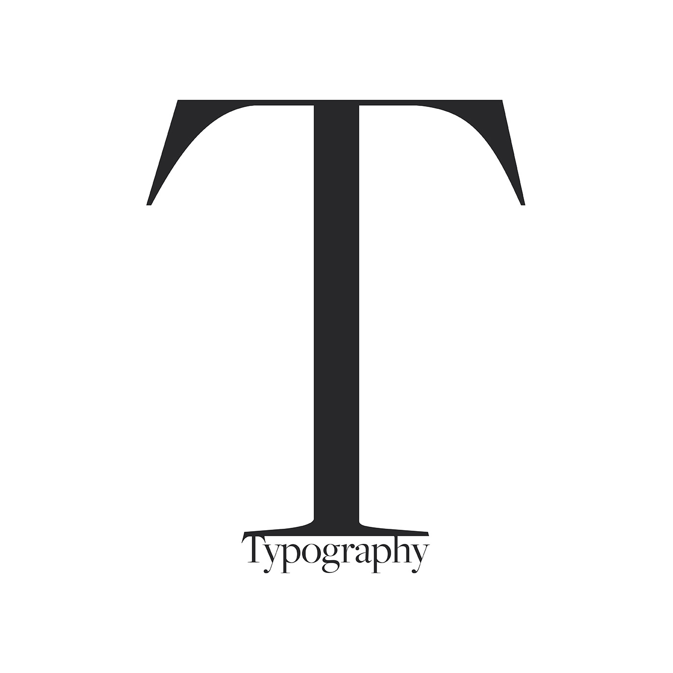
Typography isn't decoration. It's the vehicle carrying most of your expression.
The gap between mediocre typography and exceptional typography is smaller than you think. We're not talking about wholesale redesigns or exotic design choices that scream "look at me." We're talking about deliberate choices that elevate what could otherwise go unseen.
Whether its alignment (or strategic mis-alignment), white space, line breaks, font size, font choice or simply choosing not to apply a specific effect; all have the ability to create powerful typography.
Consider line breaks. Strategic line breaks guide the eye, create rhythm, and ensure your message lands with the intended emphasis. Break a line in the wrong spot and you've diluted your impact. Break it thoughtfully and suddenly your words carry weight.
Then there's hierarchy. Size, weight, spacing – these fundamental typographic elements tell readers what matters most. A well-structured document or page guides readers through your communication effortlessly. A poorly structured one? They're working too hard to extract meaning, and they'll likely give up.
The best typography doesn't announce itself. It will catch the eye without demanding attention, creating documents that feel approachable rather than overwhelming. It balances readability with visual interest, ensuring your content is as engaging to look at as it is to read.
Good typography will draw readers in and keep them moving through your content with ease. It creates visual breathing room, establishes natural reading rhythms, and makes even the densest technical material feel accessible.
That's the quiet power of typography exudes professionalism.
For professional services firms, this matters immensely. You're asking clients to trust you with complex, high-stakes work. Every touchpoint contributes to – or erodes – that trust.
Sloppy typography signals carelessness. Thoughtful typography signals credibility.
So what separates the firms who get this right from those who don't?
It starts with recognising that typography is a strategic decision, not a technical afterthought. A brand’s choice of typeface, how information is structured, where emphasis is placed – these decisions should align with your positioning and reinforce what makes you different.
It continues with consistency. One-off brilliance doesn't build a brand. When your typography system works time and again, people begin to recognise your branded materials before they even see your logo.
And it ends with restraint. Professional services branding thrives on discipline. A limited typographic palette, applied with precision, will always outperform a scattered approach.
Here's what most firms miss: typography is an unleveraged competitive advantage. While your professional staff pore over the words, to the nth degree, it’s how these words are place on a page that creates the initial engagement and impression.
Fix your typography and you fix dozens of brand touchpoints simultaneously. Presentation decks improve, proposals get more cut-through, and reports feel more authoritative.
And unlike many brand investments, getting typography right doesn't require ongoing expense. Typography systems can be established within Microsoft templates, or marketing materials. Documenting these typographic rules and leaving in the keep of a design or marketing team is your best bet at adherence long-term.
With restrained branding parameters and limited visual tools at your disposal, typography becomes your secret weapon. It's the difference between documents that people skim and documents they actually read. Between presentations that blur together and presentations they remember.
Professional services will always be a words-based business. Your expertise, your methodology, your differentiation – all of it gets communicated through language. That's not changing. What can change is whether your words merely exist on the page or whether they command attention and respect.
Give your words the typographic treatment they deserve. In professional services, where credibility is currency and every impression matters, how you say it is as important as what you say.


February 2026
Think about the last proposal you submitted. How many pages? Twenty? Forty? More? That's a lot of content competing for attention. And here's the reality: evaluators don't read every word. They scan. They skip. They hunt for the information that matters to their decision.
Your typography either helps them find it or hides it from view.
Professional services firms face a particular challenge. Credibility hinges on appearing capable, competent, and trustworthy. And this inherently limits your visual options to gain attention in a crowded market.
This throws more importance onto the humble word and how we treat it.
So here's the thing: if words are your primary visual asset, their presentation becomes critical.
Typography isn't decoration. It's the vehicle carrying most of your expression.
The gap between mediocre typography and exceptional typography is smaller than you think. We're not talking about wholesale redesigns or exotic design choices that scream "look at me." We're talking about deliberate choices that elevate what could otherwise go unseen.
Whether its alignment (or strategic mis-alignment), white space, line breaks, font size, font choice or simply choosing not to apply a specific effect; all have the ability to create powerful typography.
Consider line breaks. Strategic line breaks guide the eye, create rhythm, and ensure your message lands with the intended emphasis. Break a line in the wrong spot and you've diluted your impact. Break it thoughtfully and suddenly your words carry weight.
Then there's hierarchy. Size, weight, spacing – these fundamental typographic elements tell readers what matters most. A well-structured document or page guides readers through your communication effortlessly. A poorly structured one? They're working too hard to extract meaning, and they'll likely give up.
The best typography doesn't announce itself. It will catch the eye without demanding attention, creating documents that feel approachable rather than overwhelming. It balances readability with visual interest, ensuring your content is as engaging to look at as it is to read.
Good typography will draw readers in and keep them moving through your content with ease. It creates visual breathing room, establishes natural reading rhythms, and makes even the densest technical material feel accessible.
That's the quiet power of typography exudes professionalism.
For professional services firms, this matters immensely. You're asking clients to trust you with complex, high-stakes work. Every touchpoint contributes to – or erodes – that trust.
Sloppy typography signals carelessness. Thoughtful typography signals credibility.
So what separates the firms who get this right from those who don't?
It starts with recognising that typography is a strategic decision, not a technical afterthought. A brand’s choice of typeface, how information is structured, where emphasis is placed – these decisions should align with your positioning and reinforce what makes you different.
It continues with consistency. One-off brilliance doesn't build a brand. When your typography system works time and again, people begin to recognise your branded materials before they even see your logo.
And it ends with restraint. Professional services branding thrives on discipline. A limited typographic palette, applied with precision, will always outperform a scattered approach.
Here's what most firms miss: typography is an unleveraged competitive advantage. While your professional staff pore over the words, to the nth degree, it’s how these words are place on a page that creates the initial engagement and impression.
Fix your typography and you fix dozens of brand touchpoints simultaneously. Presentation decks improve, proposals get more cut-through, and reports feel more authoritative.
And unlike many brand investments, getting typography right doesn't require ongoing expense. Typography systems can be established within Microsoft templates, or marketing materials. Documenting these typographic rules and leaving in the keep of a design or marketing team is your best bet at adherence long-term.
With restrained branding parameters and limited visual tools at your disposal, typography becomes your secret weapon. It's the difference between documents that people skim and documents they actually read. Between presentations that blur together and presentations they remember.
Professional services will always be a words-based business. Your expertise, your methodology, your differentiation – all of it gets communicated through language. That's not changing. What can change is whether your words merely exist on the page or whether they command attention and respect.
Give your words the typographic treatment they deserve. In professional services, where credibility is currency and every impression matters, how you say it is as important as what you say.