YOUR BRAND
IMPLEMENTATION PARTNER


© BrandOps Creative Pty Ltd. All rights reserved.
Australian Policy Online (APO) is a comprehensive digital platform providing policy research, analysis and resources to government, academia and the broader policy community. APO serves as a critical knowledge hub, making complex policy information accessible to decision-makers and researchers across Australia.
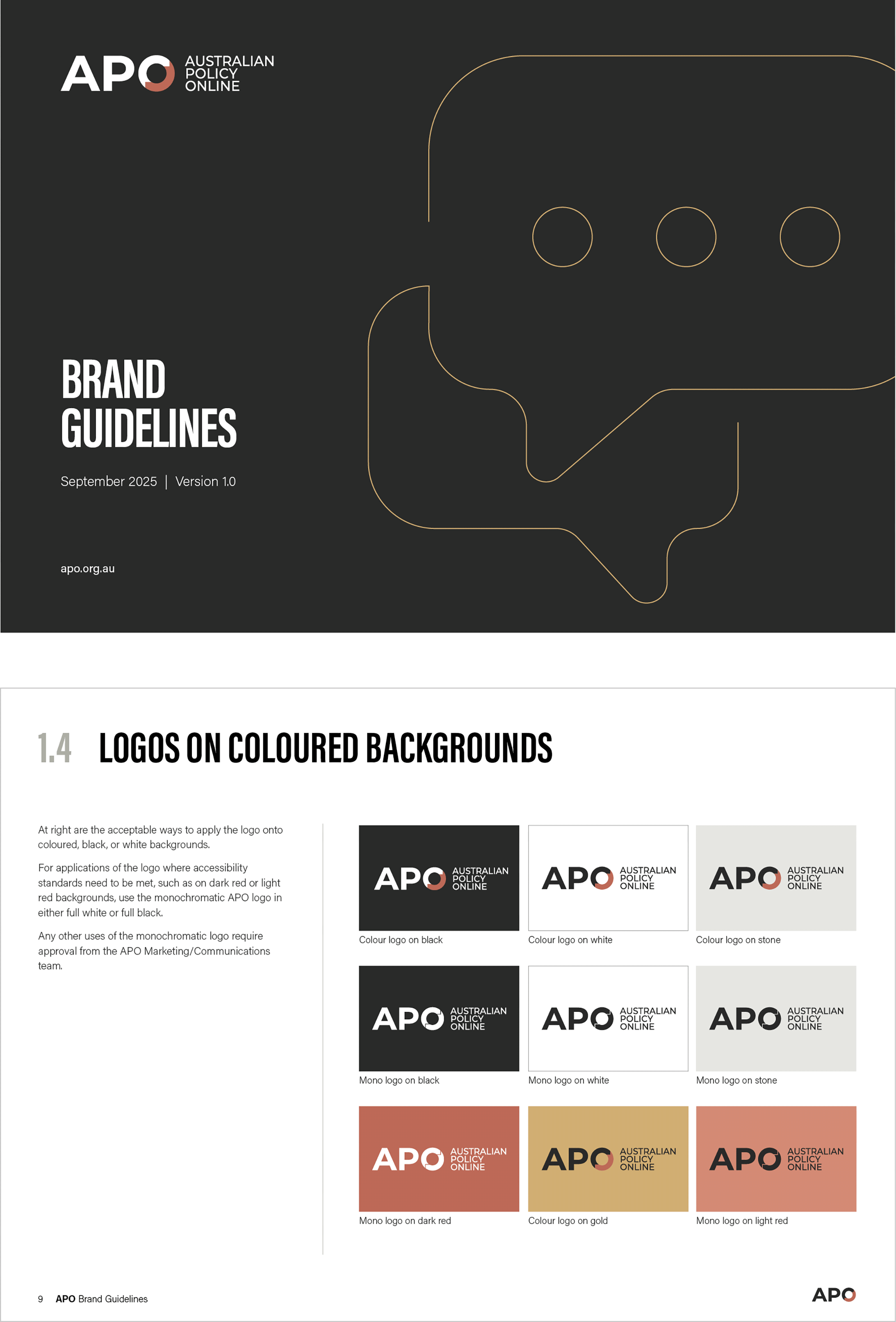
Our engagement with APO centred on developing brand concepts that would maintain strong visual connections to their parent brand McKinnon whilst establishing APO's distinct identity within the policy landscape. Given APO's commitment to inclusive access to information, accessibility standards were paramount to the client. We worked within stringent accessibility frameworks to ensure the final brand would be fully accessible to users with vision impairments and other disabilities.
As the brief was to align with the parent brand while holding true to a unique visual identity that met AAA accessibility standards. Working through the challenges of creating branding that meets accessibility, we created multiple colour concept options that balanced McKinnon's established equity with APO's unique positioning.
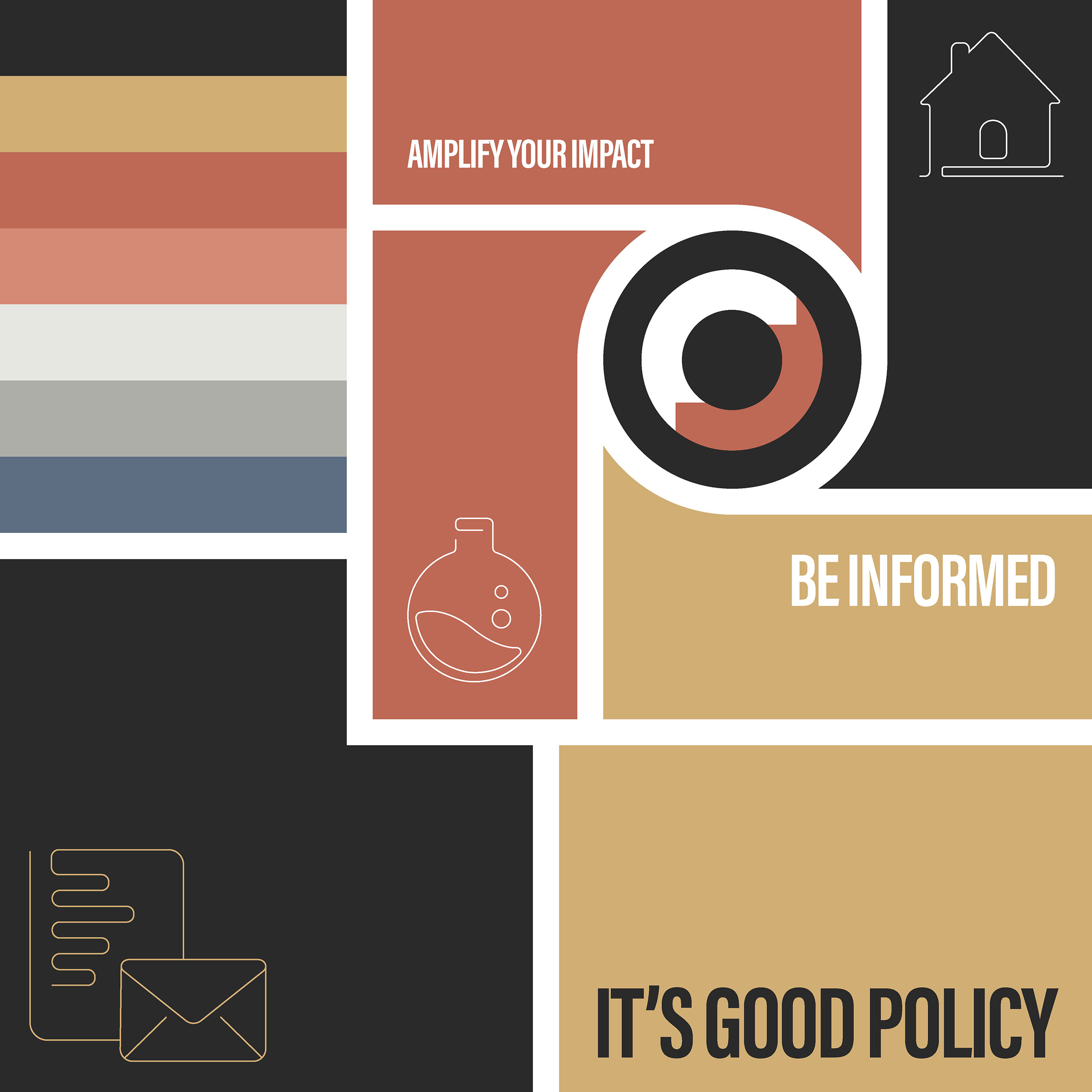
The chosen brand system prioritises clarity and usability, reflecting APO's role in making complex policy information accessible to diverse audiences. The selected concept had simplified graphic elements that maintain visual impact.
We delivered a series of Word and PowerPoint templates that were optimised for accessibility yet visually striking.
► Visual Brand Concepts
► Social Media Assets
► Canva Templates
► eDM Designs
► Website Design Guidance
► Word and PowerPoint Templates
► Email Signatures


Australian Policy Online (APO) is a comprehensive digital platform providing policy research, analysis and resources to government, academia and the broader policy community. APO serves as a critical knowledge hub, making complex policy information accessible to decision-makers and researchers across Australia.
Our engagement with APO centred on developing brand concepts that would maintain strong visual connections to their parent brand McKinnon whilst establishing APO's distinct identity within the policy landscape. Given APO's commitment to inclusive access to information, accessibility standards were paramount to the client. We worked within stringent accessibility frameworks to ensure the final brand would be fully accessible to users with vision impairments and other disabilities.
As the brief was to align with the parent brand while holding true to a unique visual identity that met AAA accessibility standards. Working through the challenges of creating branding that meets accessibility, we created multiple colour concept options that balanced McKinnon's established equity with APO's unique positioning.
The chosen brand system prioritises clarity and usability, reflecting APO's role in making complex policy information accessible to diverse audiences. The selected concept had simplified graphic elements that maintain visual impact.
We delivered a series of Word and PowerPoint templates that were optimised for accessibility yet visually striking.
► Visual Brand Concepts
► Social Media Assets
► Canva Templates
► eDM Design
► Website Design Guidance
► Word and PowerPoint Templates
► Email Signatures