YOUR BRAND
IMPLEMENTATION PARTNER


© BrandOps Creative Pty Ltd. All rights reserved.
Crew is a financial services firm experiencing an evolution, diversifying their offering to serve a premium and niche consumer market.
Crew recognised that their existing brand identity – anchored in red – no longer aligned with their premium positioning or the trust expectations inherent to financial services. Red, while energetic, carries negative associations in the financial sector.
Crew needed a complete visual rebrand that would signal their evolution, communicate trustworthiness, and position them competitively in the premium financial services space while respecting the equity they'd built in their established presence.
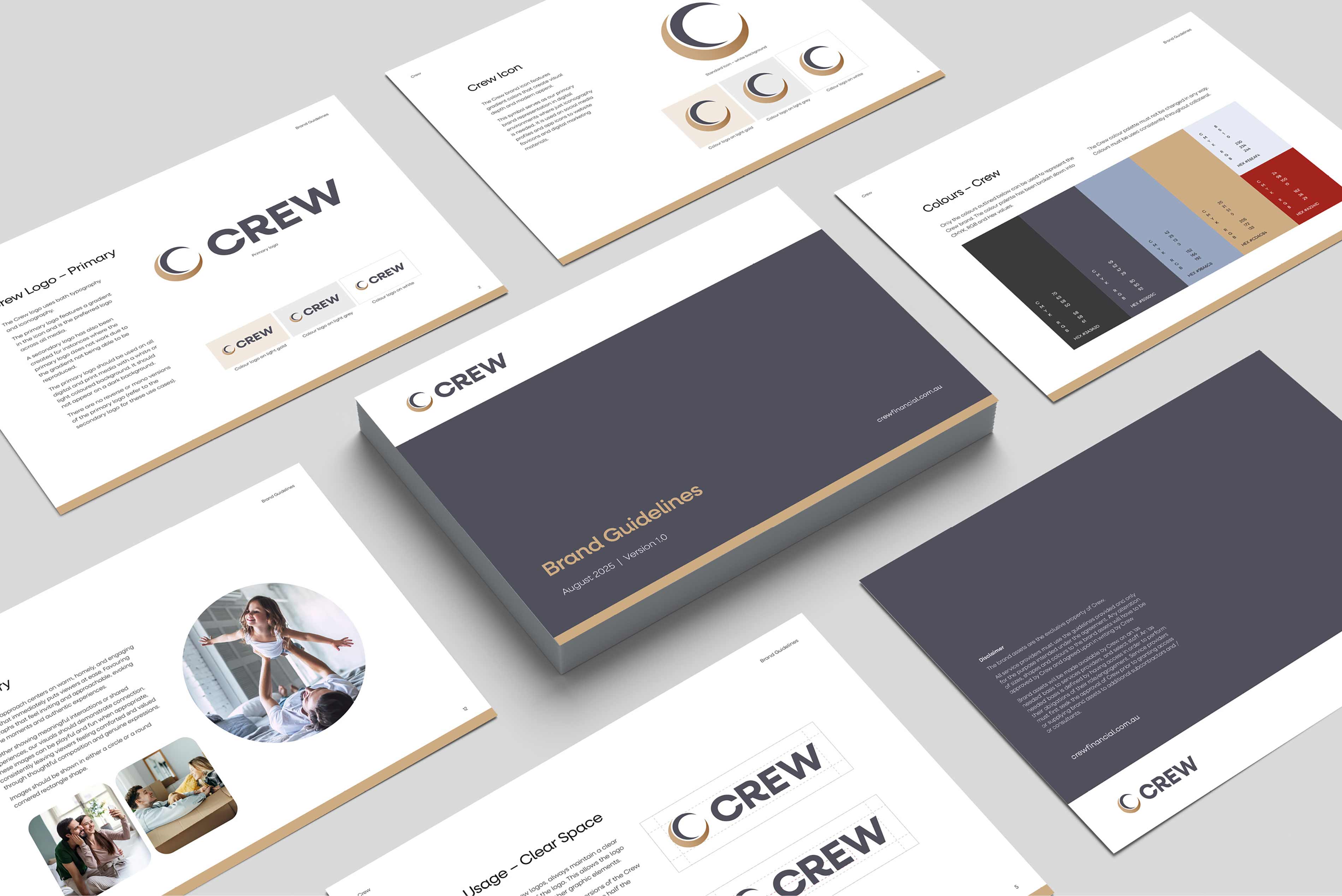
We developed multiple comprehensive brand concepts, each exploring different strategic directions for Crew's visual identity. Our colour strategy centred on navy to convey trust and stability – essential attributes in financial services – paired with gold to signal premium quality and aspirational value.
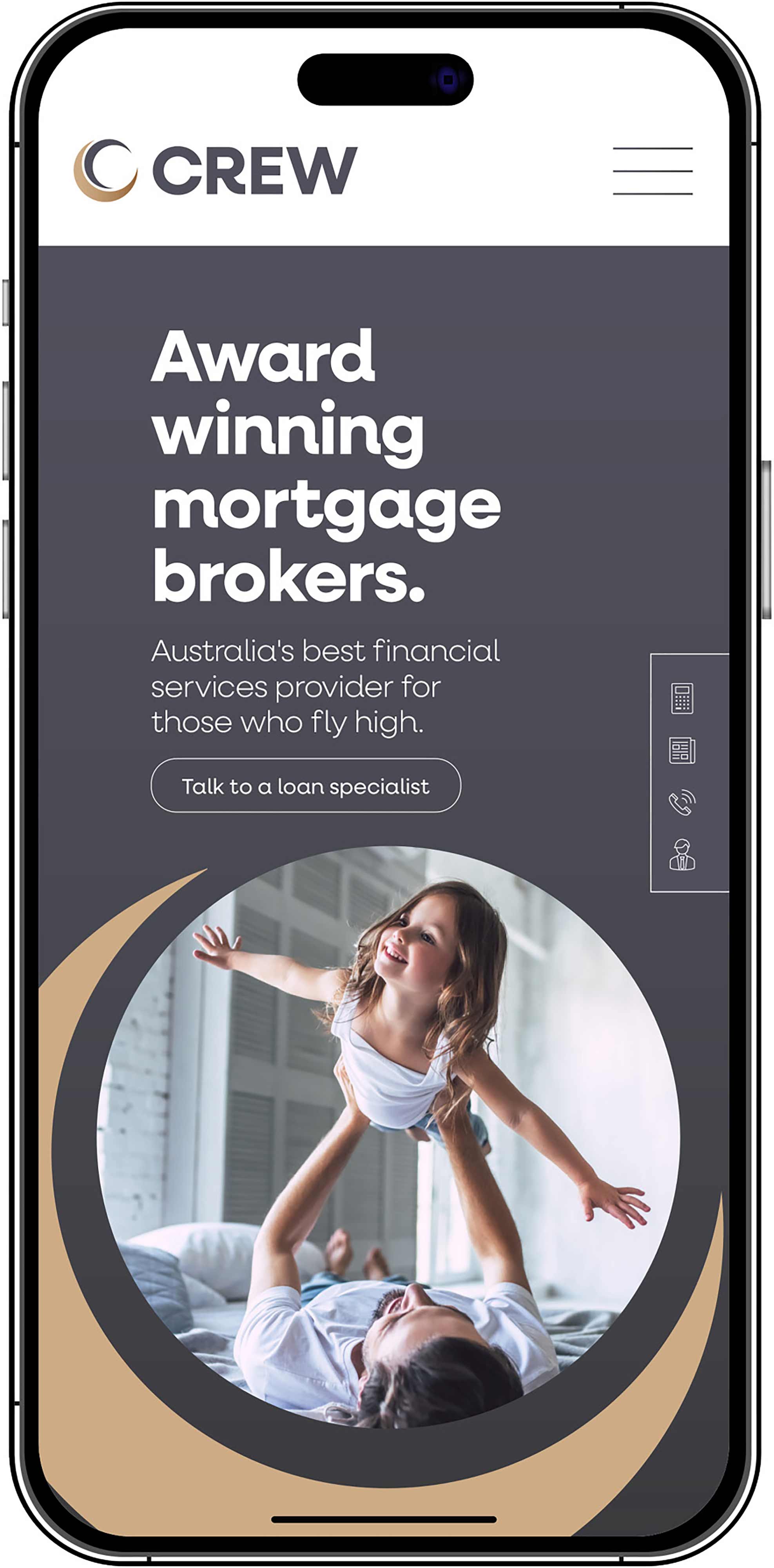
Each concept was brought to life through key brand touchpoints including website homepage designs and LinkedIn social media mastheads, allowing Crew to evaluate how each direction would perform across their critical customer-facing channels.
The chosen concept successfully balanced heritage with evolution. It drew inspiration from Crew's original circular logo, reimagining this familiar element in a contemporary, upmarket execution that honoured their history while clearly signalling their premium repositioning.
The result was a sophisticated visual identity that felt both trustworthy and aspirational – perfectly aligned to Crew's diversified B2C offering and premium market positioning.
► Brand concepts (multiple)
► Website homepage designs
► Brand guidelines


► Financial services consumers
► Premium market clients
► Airline industry
► B2C customers
Crew is a financial services firm experiencing an evolution, diversifying their offering to serve a premium and niche consumer market.
Crew recognised that their existing brand identity – anchored in red – no longer aligned with their premium positioning or the trust expectations inherent to financial services. Red, while energetic, carries negative associations in the financial sector.
Crew needed a complete visual rebrand that would signal their evolution, communicate trustworthiness, and position them competitively in the premium financial services space while respecting the equity they'd built in their established presence.
We developed multiple comprehensive brand concepts, each exploring different strategic directions for Crew's visual identity. Our colour strategy centred on navy to convey trust and stability – essential attributes in financial services – paired with gold to signal premium quality and aspirational value.
Each concept was brought to life through key brand touchpoints including website homepage designs and LinkedIn social media mastheads, allowing Crew to evaluate how each direction would perform across their critical customer-facing channels.
The chosen concept successfully balanced heritage with evolution. It drew inspiration from Crew's original circular logo, reimagining this familiar element in a contemporary, upmarket execution that honoured their history while clearly signalling their premium repositioning.
The result was a sophisticated visual identity that felt both trustworthy and aspirational – perfectly aligned to Crew's diversified B2C offering and premium market positioning.
► Brand concepts (multiple)
► Website homepage designs
► Brand guidelines
From top: Brand guidelines, Logo, Mobile website homepage.