YOUR BRAND
IMPLEMENTATION PARTNER


© BrandOps Creative Pty Ltd. All rights reserved.
PitchPlusX is a technology platform operating in the digital space, delivering an entirely online presence to a diverse and age-inclusive audience.
As a purely digital brand, PitchPlusX needed more than visual appeal—they required strategic clarity on how to position themselves in a competitive technology landscape and connect meaningfully with users across multiple generations.
Our engagement with PitchPlusX centred on building a brand from strategic foundations. Understanding that brands live or die by user perception and digital experience, we knew that jumping straight to visual design without strategic grounding may miss the mark.
Before developing visual brand concepts, we conducted a brand strategy session with the PitchPlusX team to determine product-market fit and strategic outcomes through design-thinking workshop activities.
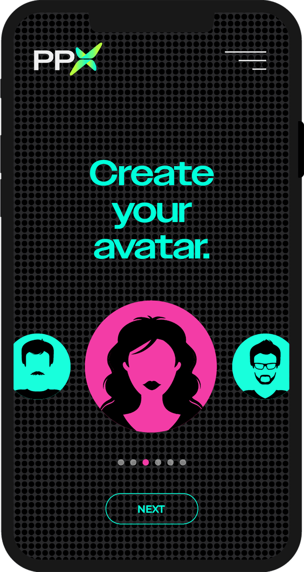
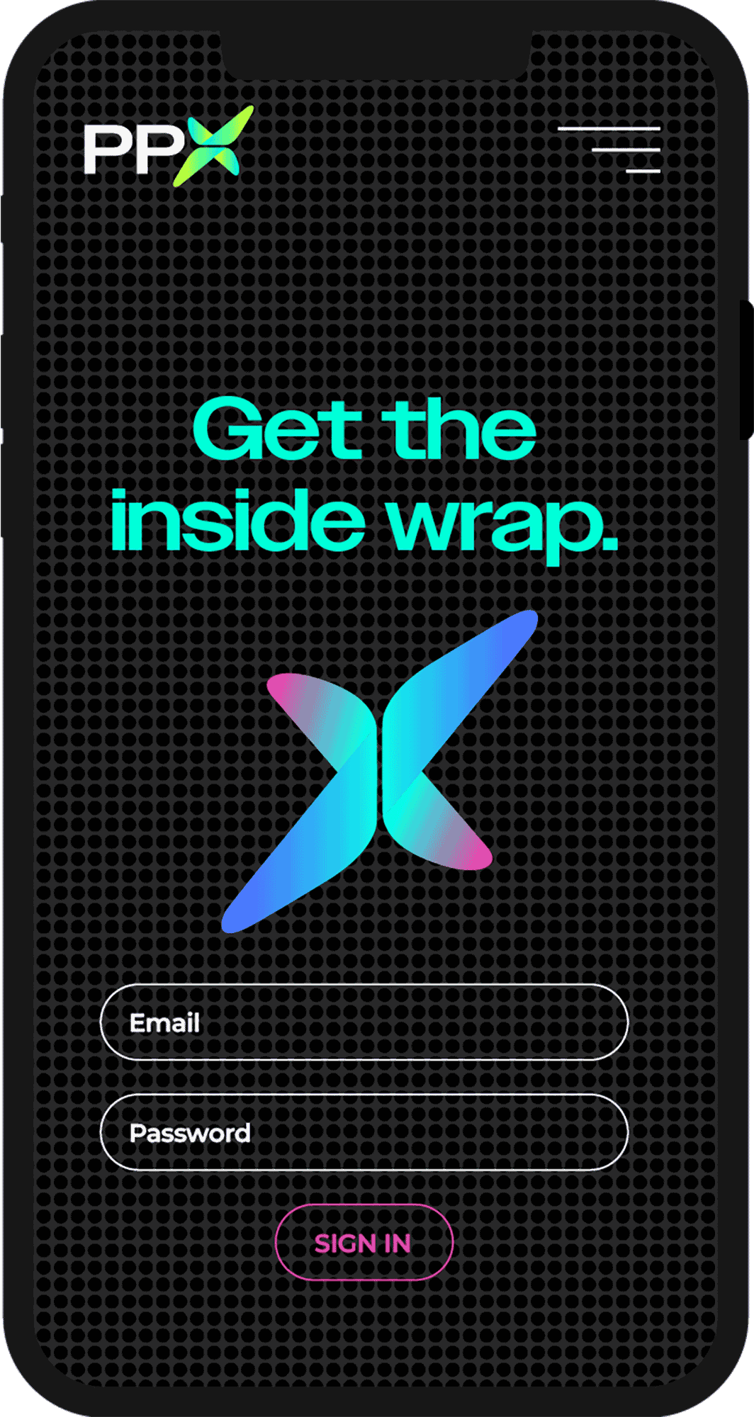
For the presentation, we designed two complete visual brand concepts off the back of the strategy work. Concept 1 focused on the clients, while Concept 2 focused on the user of the product. The chosen aesthetic reflects an accessible, technology-forward personality designed to resonate across age groups and get noticed.
The backbone of the brand is the use of a neon colour palette and the black-on-black dots that represents a scoreboard. This visual cue is imperative to the purpose of the product.
We designed a complete UI kit and a few landing pages of the App. We also delivered a comprehensive brand guidelines documenting the complete visual system—ensuring consistency as PitchPlusX scales across digital platforms.
► Brand strategy
► Visual brand concepts
► Brand guidelines
► Figma UI kit
► App designs


► Online subscribers
► C-suite executives
► Organisations and committees
► Regulatory bodies
PitchPlusX is a technology platform operating in the digital space, delivering an entirely online presence to a diverse and age-inclusive audience.
As a purely digital brand, PitchPlusX needed more than visual appeal—they required strategic clarity on how to position themselves in a competitive technology landscape and connect meaningfully with users across multiple generations.
Our engagement with PitchPlusX centred on building a brand from strategic foundations. Understanding that brands live or die by user perception and digital experience, we knew that jumping straight to visual design without strategic grounding may miss the mark.
Before developing visual brand concepts, we conducted a brand strategy session with the PitchPlusX team to determine product-market fit and strategic outcomes through design-thinking workshop activities.
For the presentation, we designed two complete visual brand concepts off the back of the strategy work. Concept 1 focused on the clients, while Concept 2 focused on the user of the product. The chosen aesthetic reflects an accessible, technology-forward personality designed to resonate across age groups and get noticed.
The backbone of the brand is the use of a neon colour palette and the black-on-black dots that represents a scoreboard. This visual cue is imperative to the purpose of the product.
We designed a complete UI kit and a few landing pages of the App. We also delivered a comprehensive brand guidelines documenting the complete visual system—ensuring consistency as PitchPlusX scales across digital platforms.
► Brand strategy
► Visual brand concepts
► Brand guidelines
► Figma UI kit
► App designs
From top: Brand guidelines, App designs.