YOUR BRAND
IMPLEMENTATION PARTNER


© BrandOps Creative Pty Ltd. All rights reserved.
Ventura Buses (Ventura) is one of Melbourne’s largest bus operators, serving communities across metropolitan Melbourne and regional Victoria. With a fleet of over 400 buses and more than 600 employees, Ventura connects thousands of passengers to work, education and essential services every day.
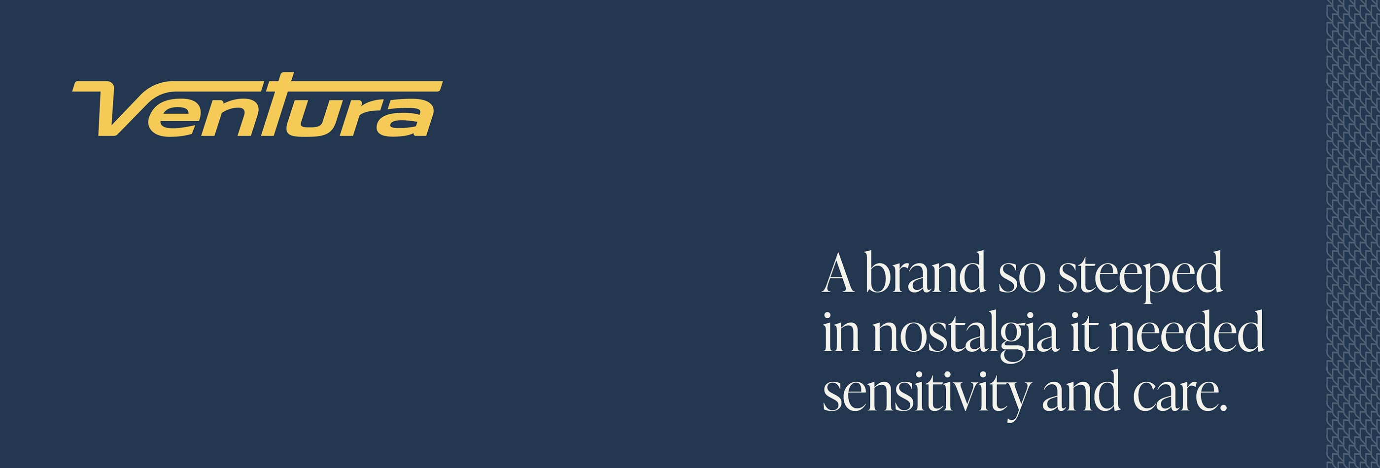
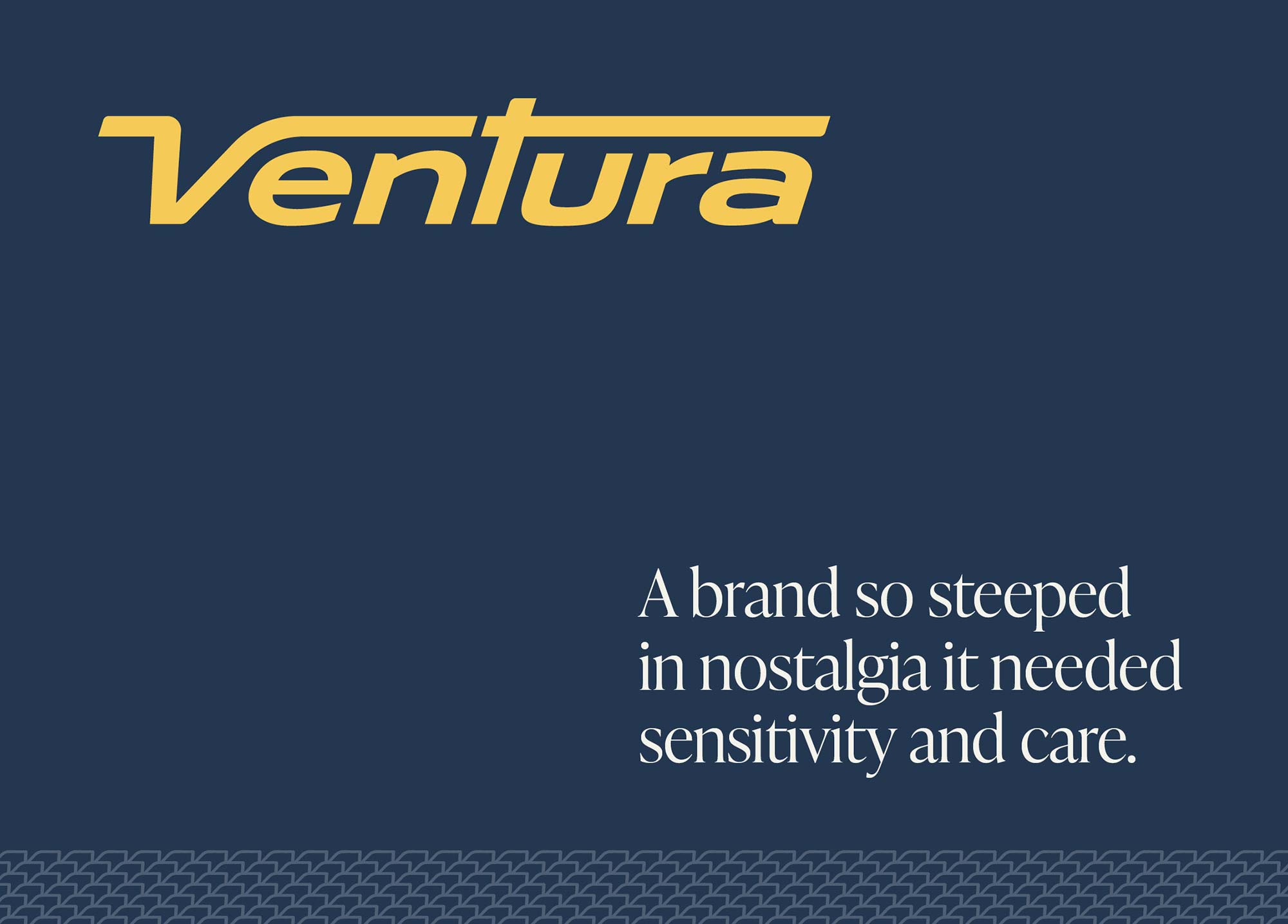
Our engagement with Ventura centred on a brand refresh that would honour decades of community connection while propelling the company forward. The existing logo carried significant emotional equity, as passengers and staff alike held deep attachments to a brand that had been part of their daily lives for years. The challenge was clear: respect the past whilst designing for the future.
Brand refresh
Ventura’s refresh demanded sensitivity to heritage and boldness for the future. We developed two initial visual brand concepts, with a third emerging from Ventura’s feedback. The final brand design celebrates all things Ventura: the buses, the roads they travel, the journeys they take and the moments of rest at the depot. This includes arriving and departing graphics, roadway graphics, aerial journey map graphics with bus overlays, aerial ‘buses at the depot’ compositions, custom illustrations, pattern and bespoke icons. It is an extensive brand with more graphical approaches than we have seen before, creating a visual language as dynamic as the network itself.
Brand Implementation
We were asked by Ventura to help with the brand implementation, due to a tight rollout timeframe.
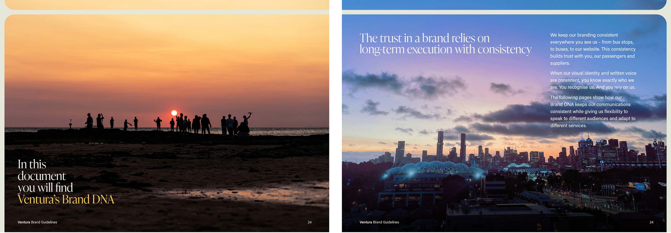
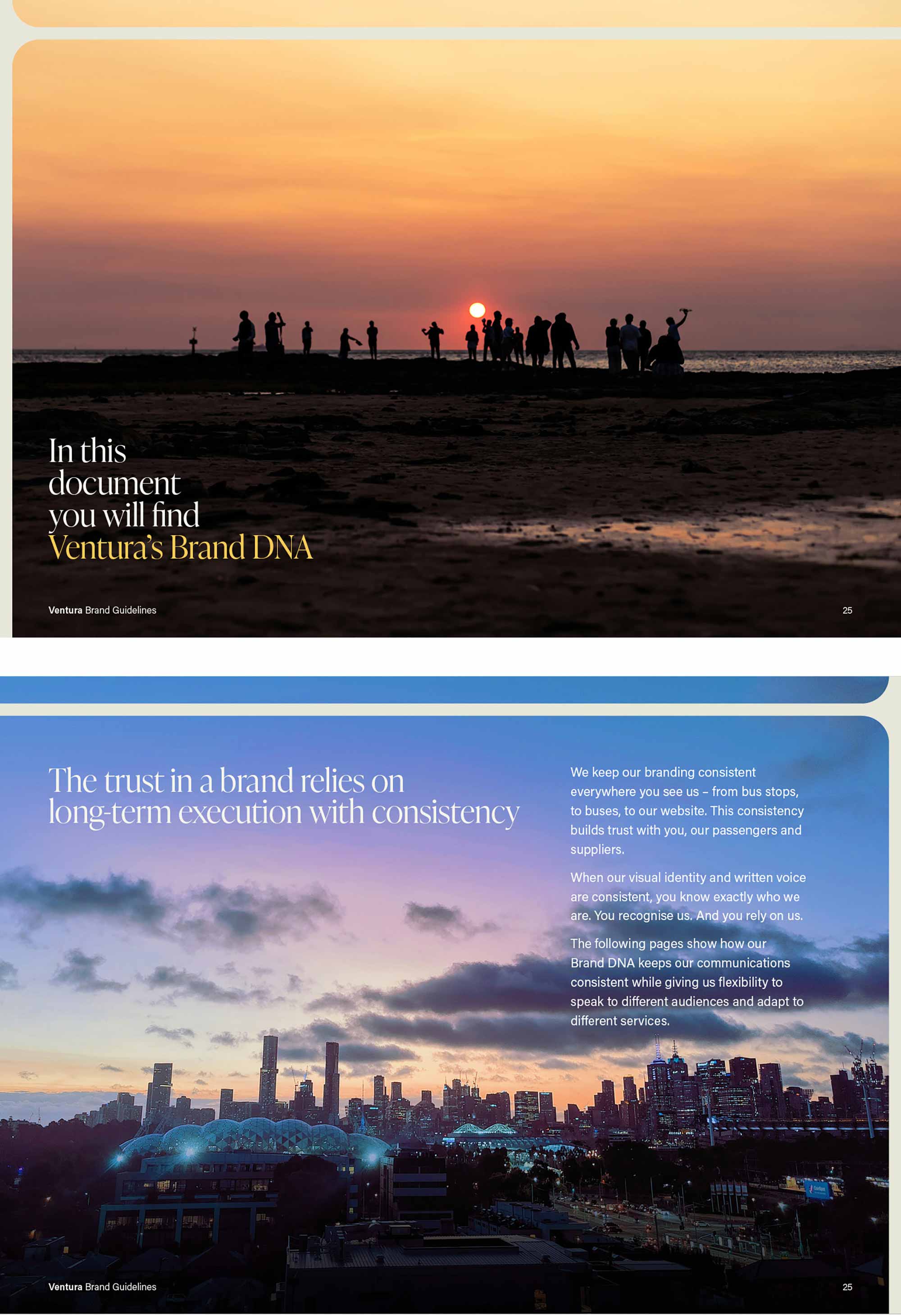
Brand implementation requires technical design execution skills and overarching project management capabilities that rarely exist in-house. For firms like Ventura, having a professional partner across this work is essential for the successful rollout of their brand, ensuring consistency, efficiency and impact at every stage.
Microsoft templates
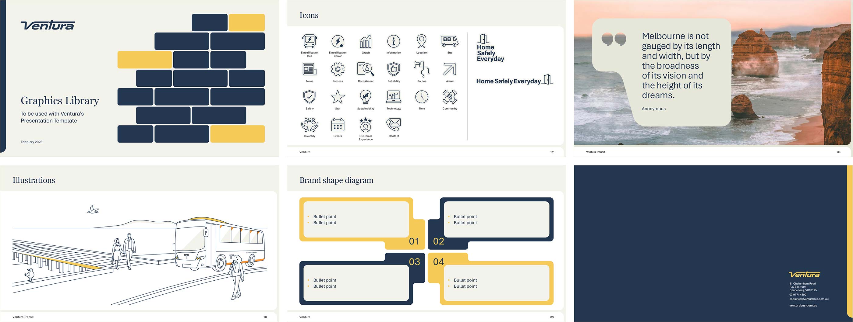
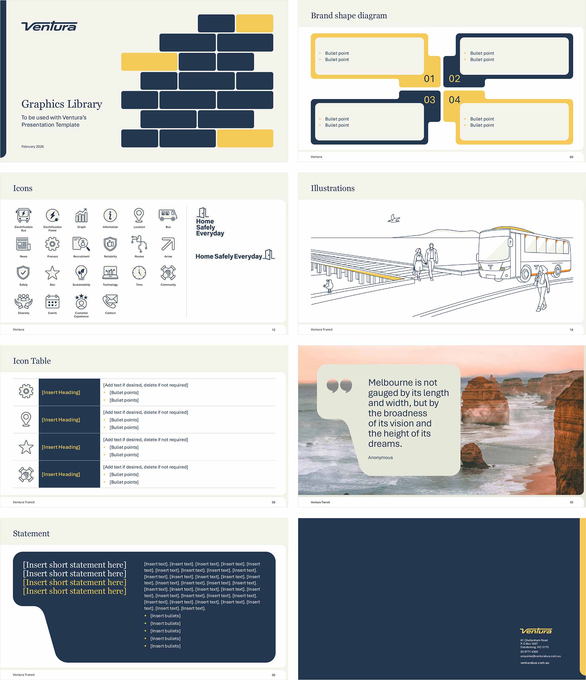
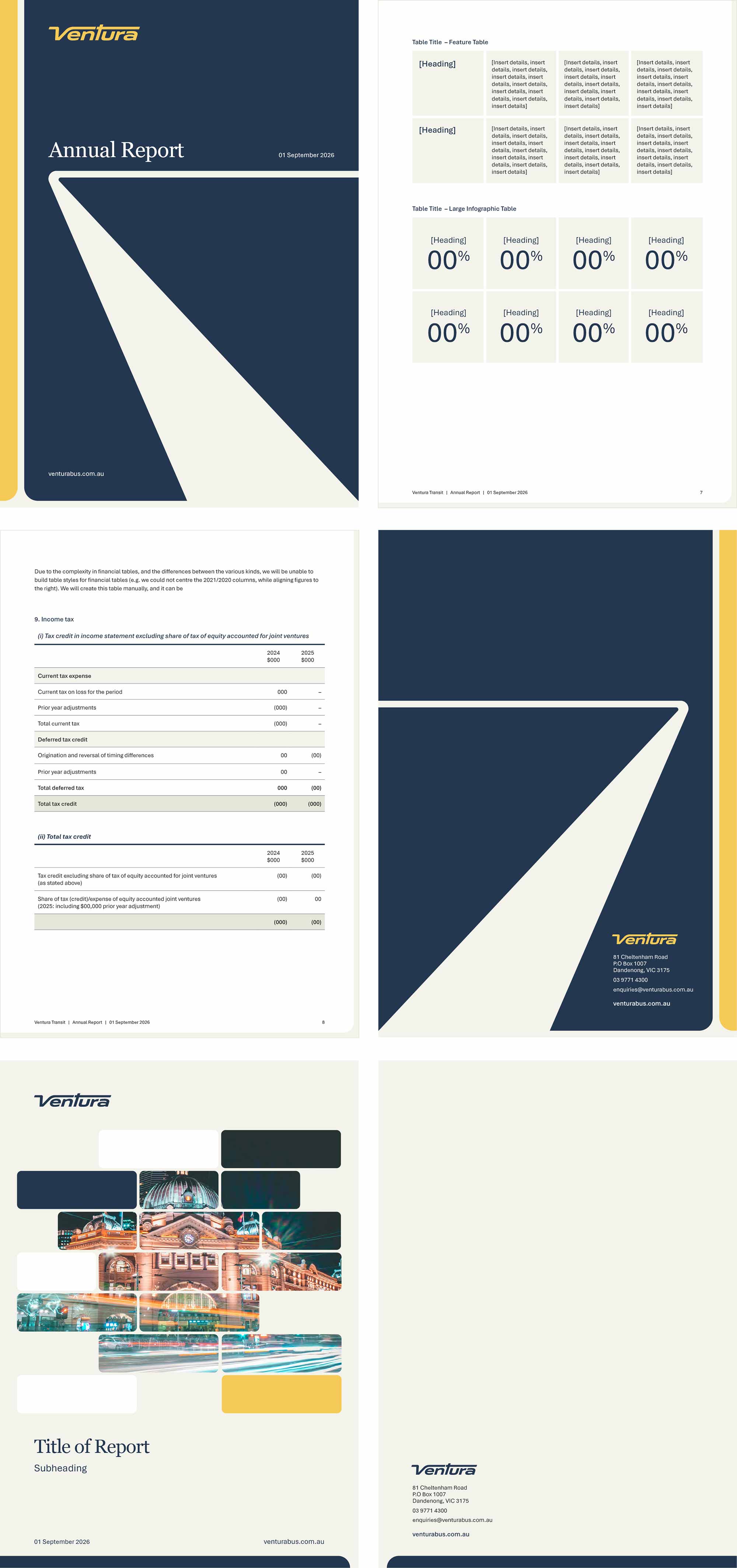
Microsoft template deliverables included the design and development of Word templates for Long Report, Annual Report, Letterhead and six operational forms, plus PowerPoint Presentation templates and a 100-page graphics library.
► Visual Brand Concepts
► Visual Brand Guidelines
► Charter Bus Livery Design
► Depot Signage
► Website Design
► Word and PowerPoint Templates
► Business Cards
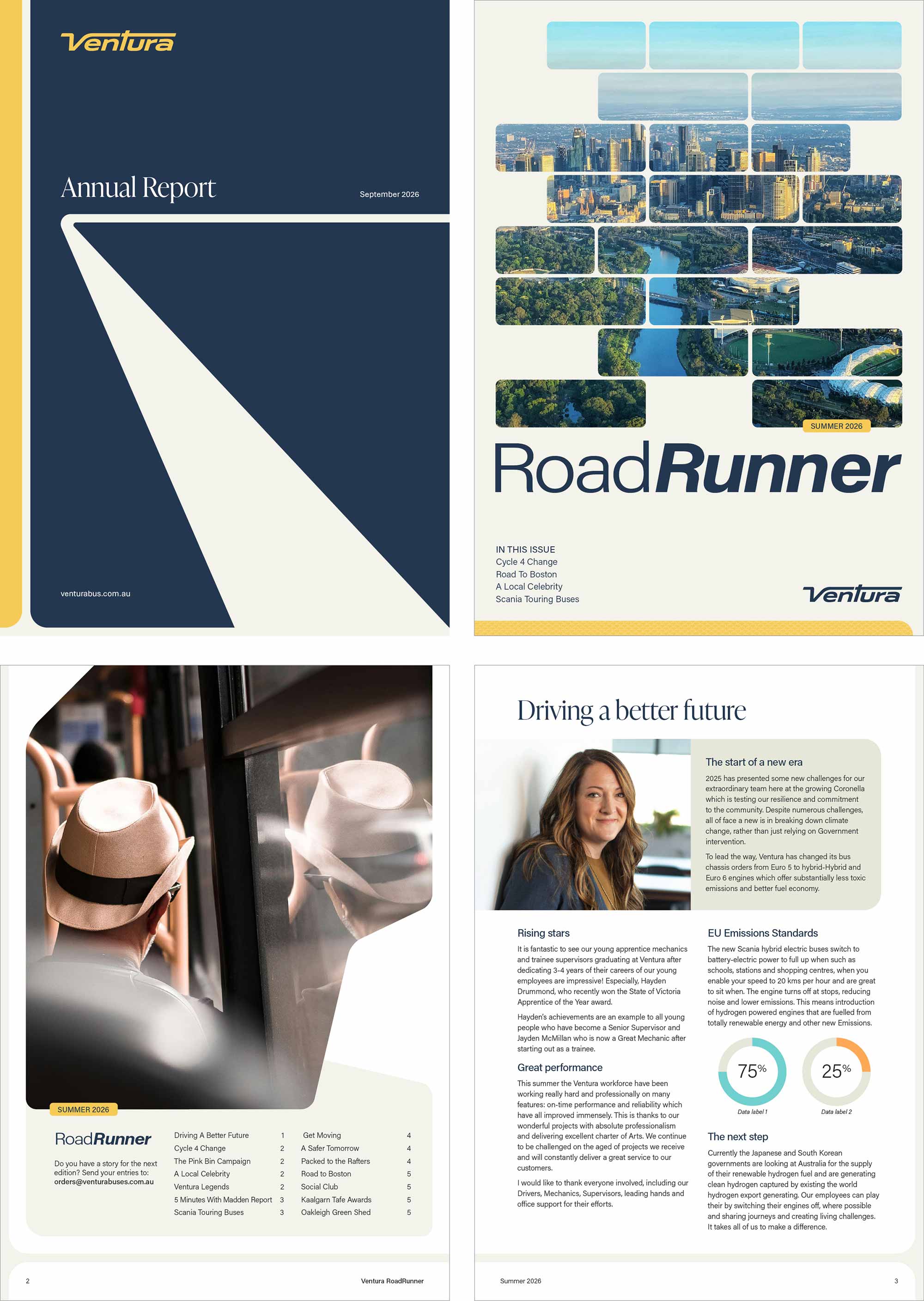
► Internal Magazine
► Email Signatures
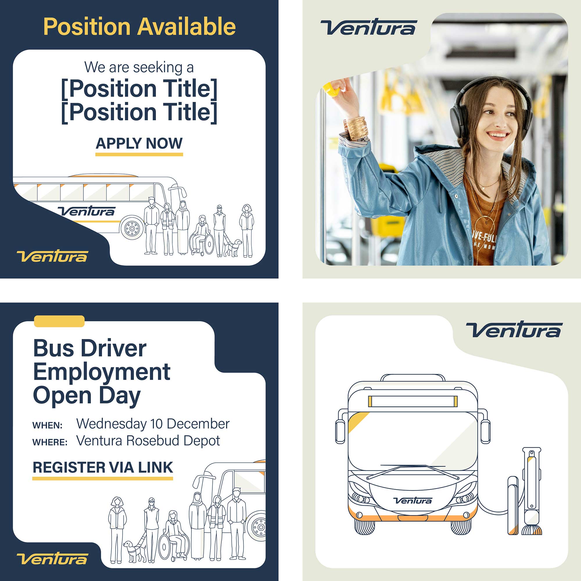
► Social Media Assets
► Teams Backgrounds
► TV Screen Communications
► Posters
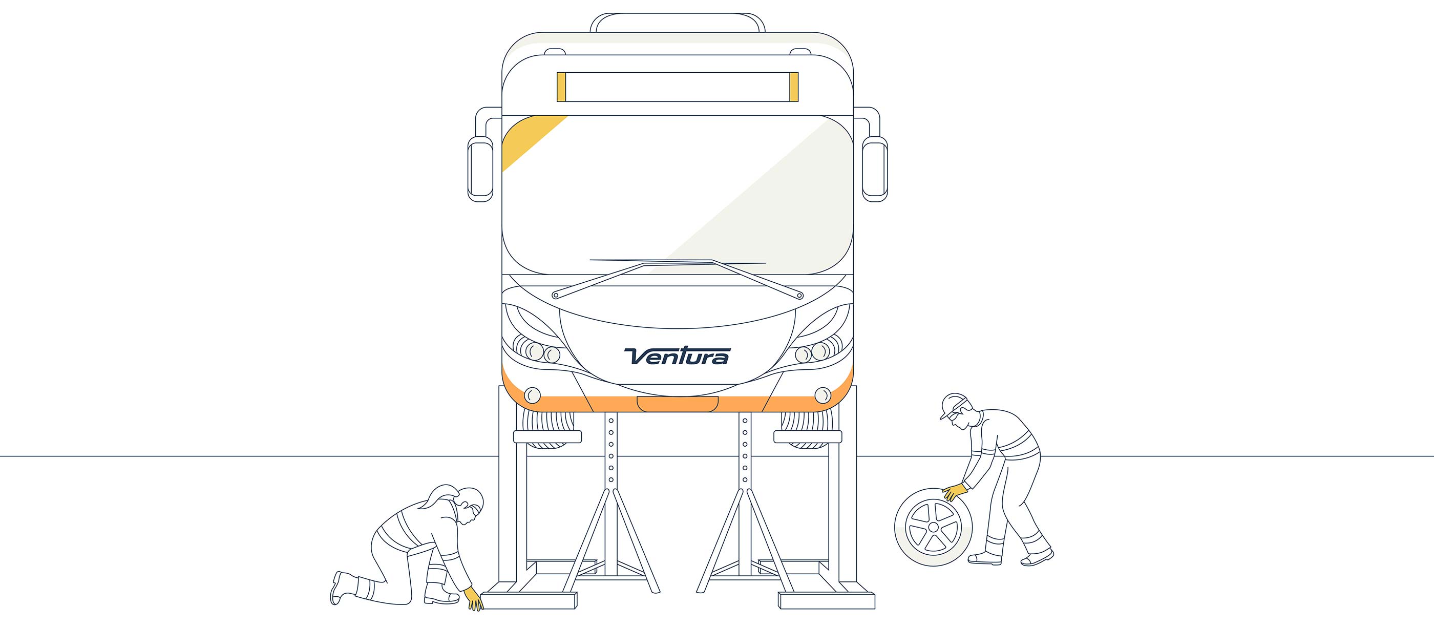
A custom wordmark that honours Ventura's heritage through its distinctive italic slant and elongated V, while delivering a bold, contemporary identity built for the future.
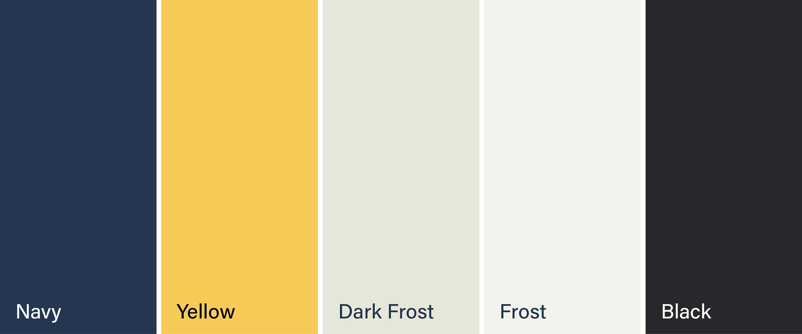
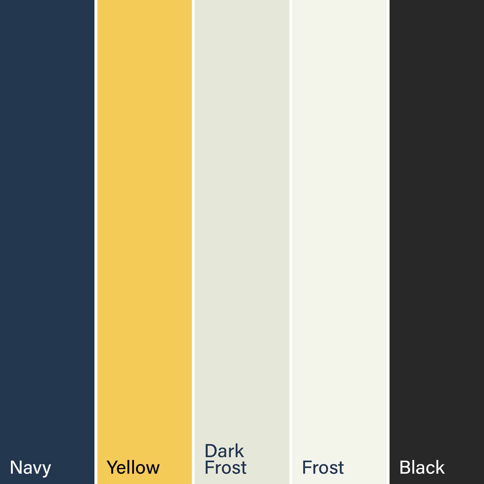
A rich, considered palette anchored in Navy and Gold, with warm neutrals and supporting tones that balance heritage with contemporary confidence.
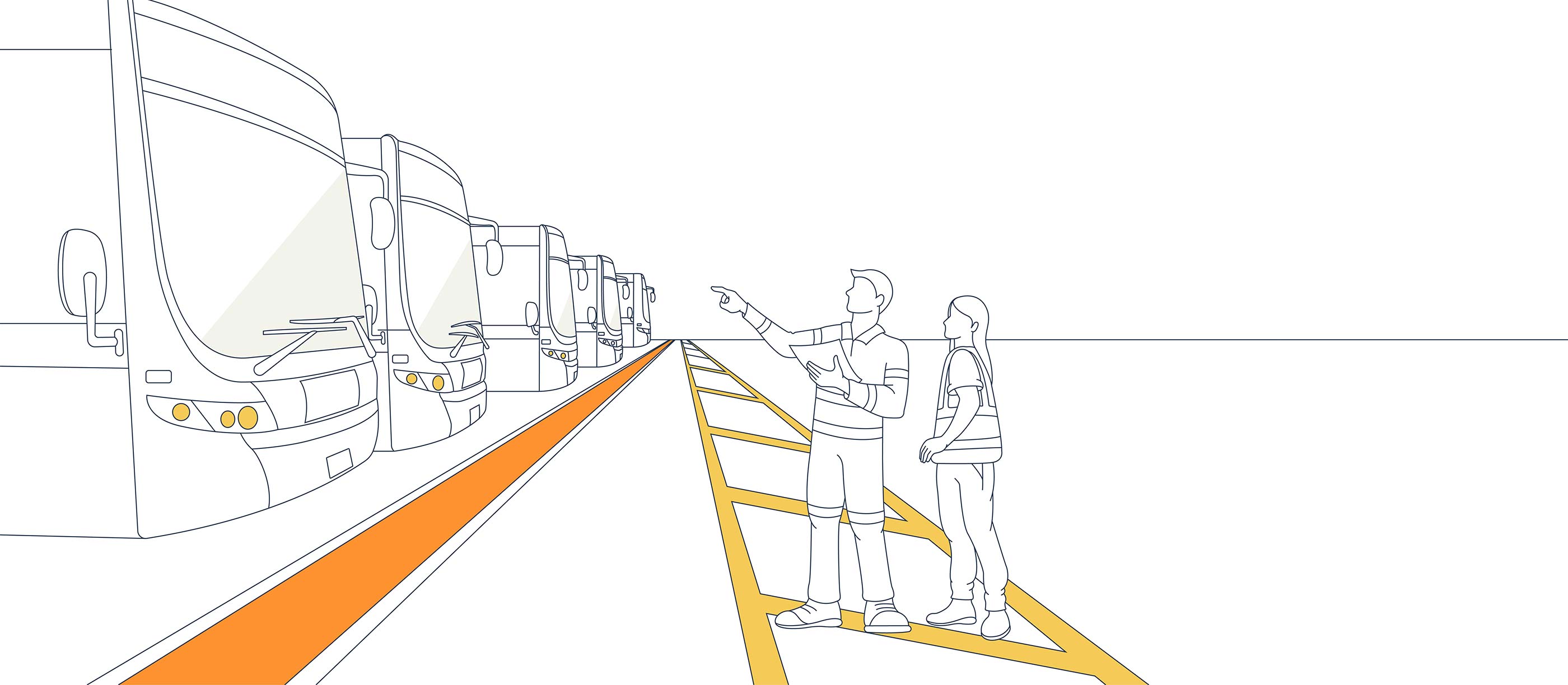
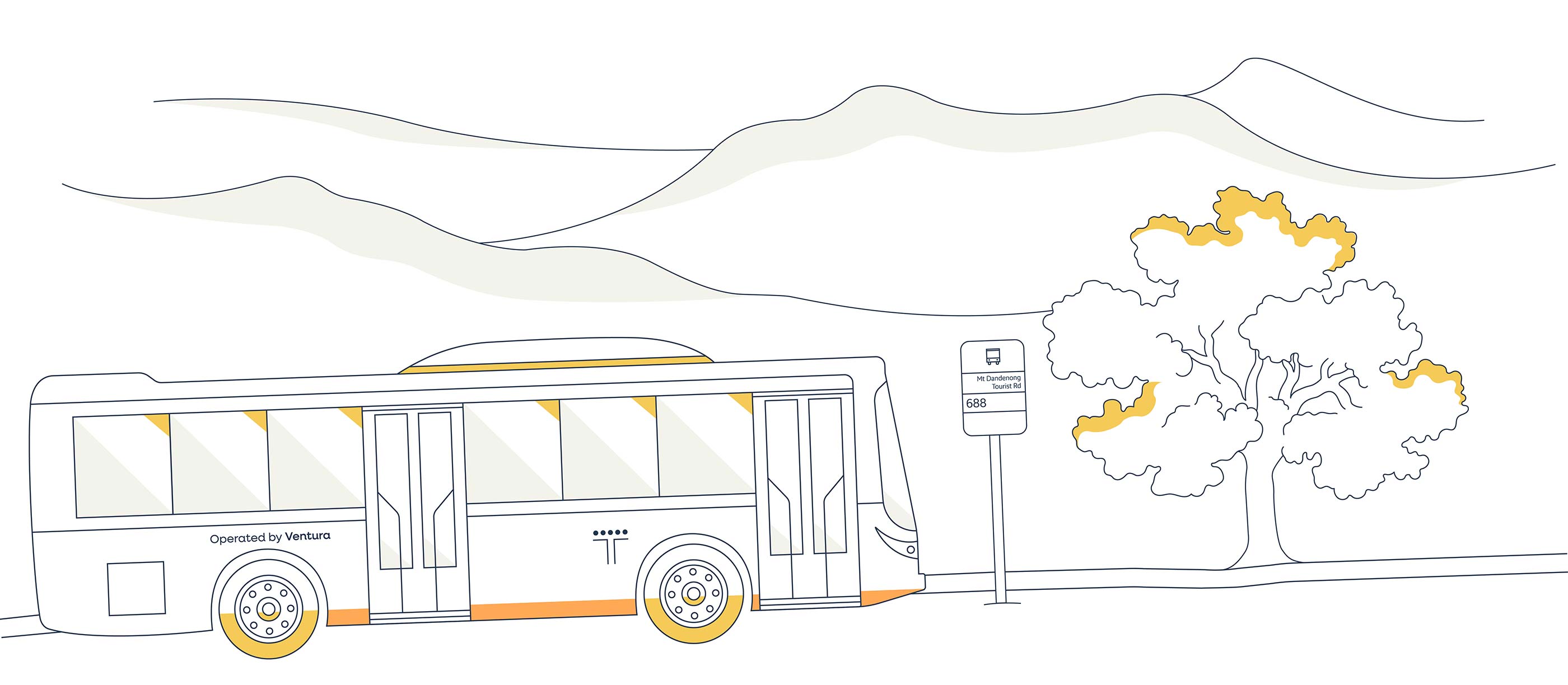
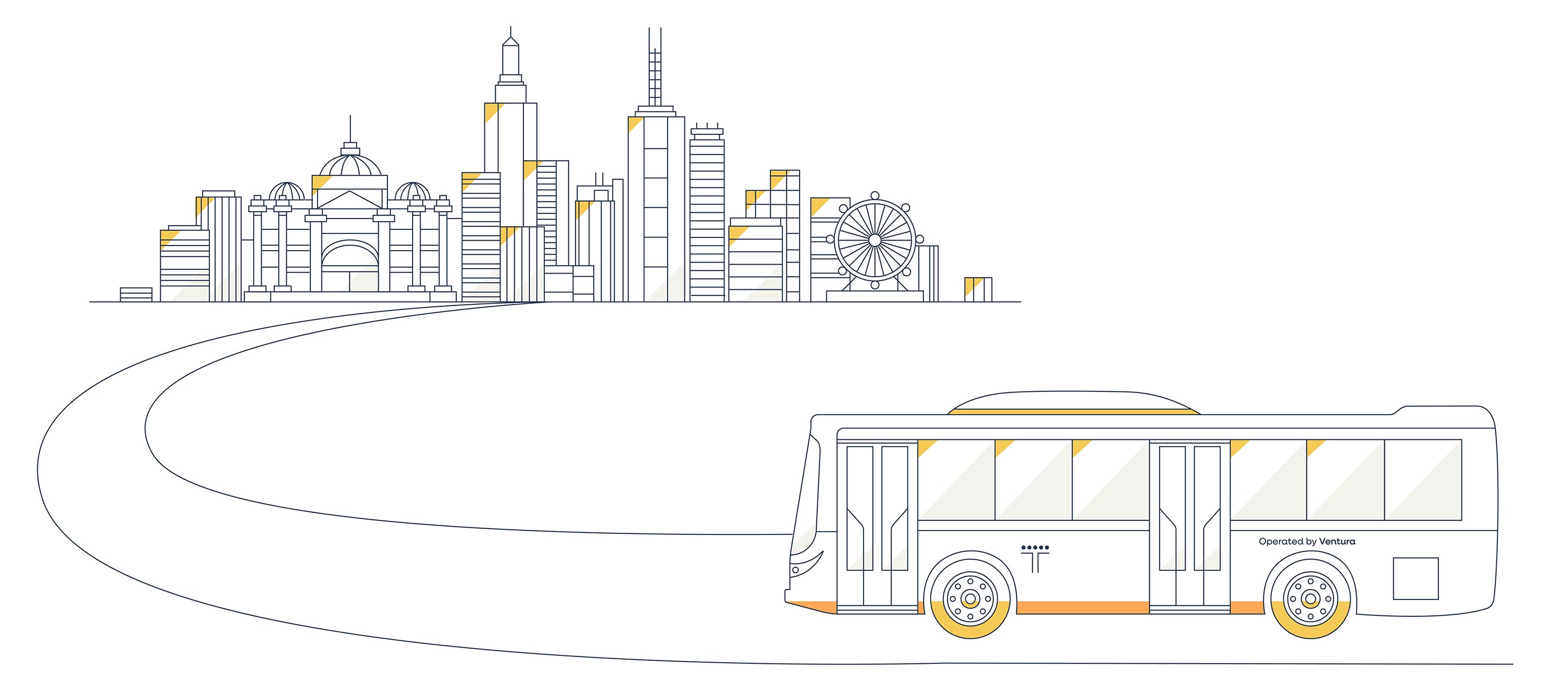
Perspective road graphics that capture the essence of journeys beginning and ending, grounding every communication in the movement that defines Ventura.

Inspired by a satellite view of Ventura’s Dandenong depot, this aerial composition of buses at rest is an ownable, authentically Ventura graphic device.

Multiple different abstract aerial shapes that represent Ventura bus routes (one kind shown). These fluid shapes bring the network to life and add dynamic movement to brand communications.

A simple intersecting road motif that quietly reinforces Ventura’s connection to the streets and communities it serves every day. Shown here in the Dark Frost colour that interrupts the image and runs through the image and down one side.
A repeating pattern built from Ventura’s distinctive V letterform, this ownable texture adds depth and visual interest to communications while staying rooted in the brand’s identity.

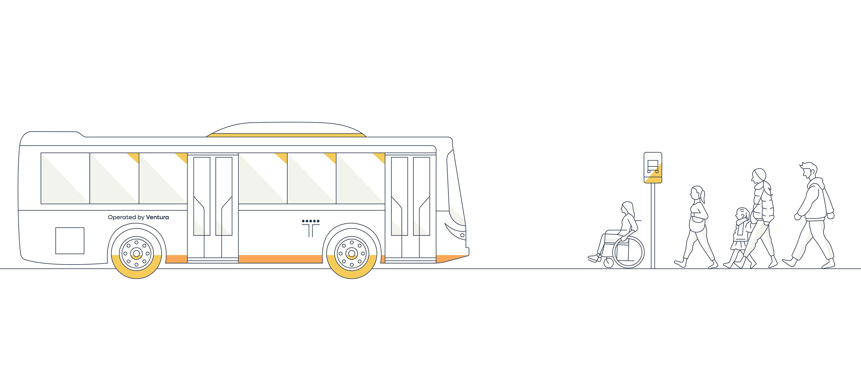
Detailed keyline scenes featuring Ventura buses across Melbourne’s suburbs, stadiums, coastlines and schoolyards — bringing the brand’s journeys to life with warmth and precision.


A suite of purposeful, keyline-based icons with a distinctive Frost base, designed to communicate services and information clearly across every brand touchpoint.
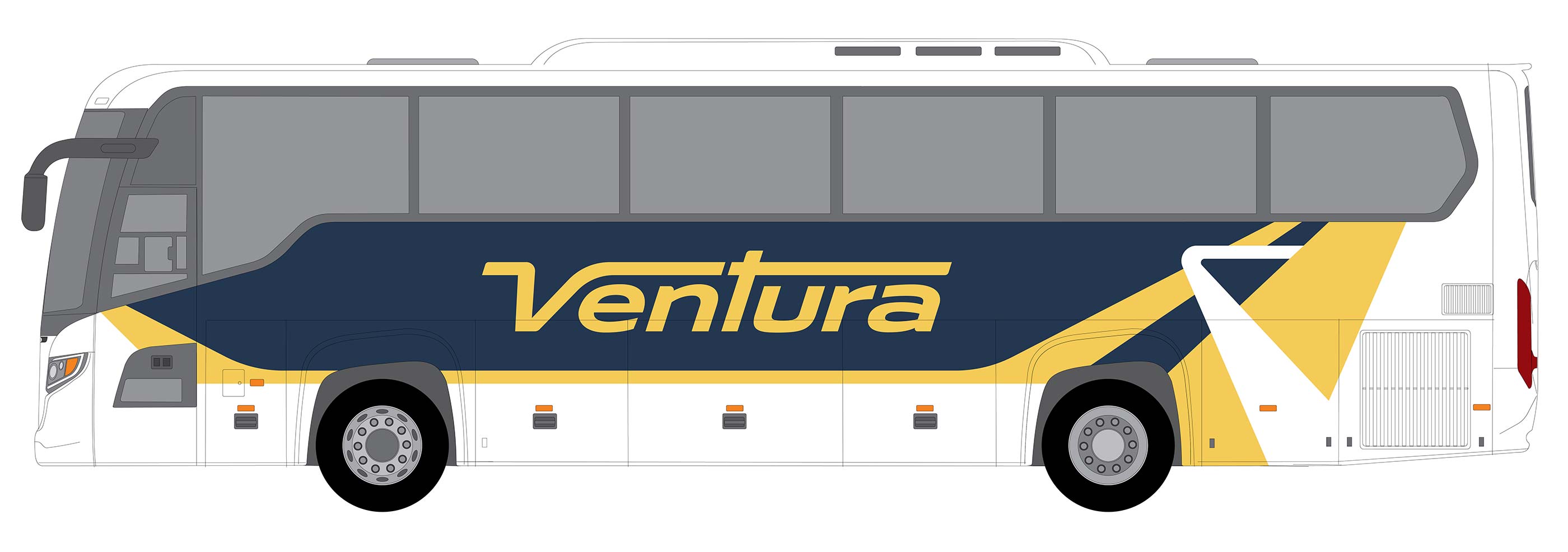
A striking Navy and Yellow livery that turns every Ventura bus into a moving brand statement, instantly recognisable across Melbourne’s roads.
A custom wordmark that honours Ventura's heritage through its distinctive italic slant and elongated V, while delivering a bold, contemporary identity built for the future.
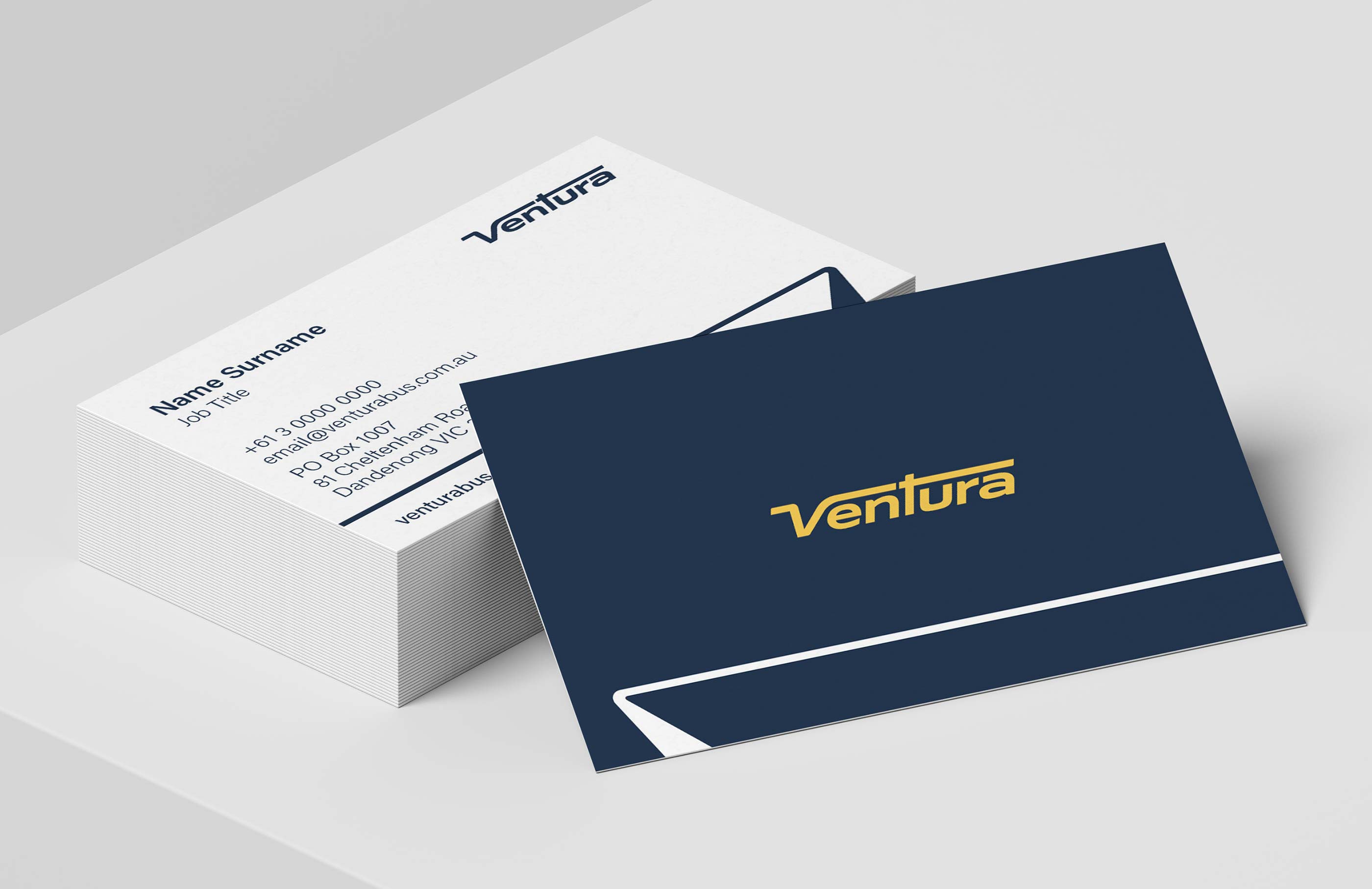
Business cards
PowerPoint

Word
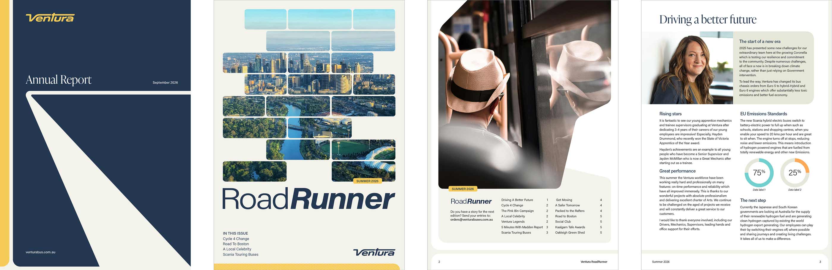
Publications

Social Media

Jordan Canovan
Marketing & Communications Manager, Ventura Buses


Ventura Buses (Ventura) is one of Melbourne’s largest bus operators, serving communities across metropolitan Melbourne and regional Victoria. With a fleet of over 400 buses and more than 600 employees, Ventura connects thousands of passengers to work, education and essential services every day.
Our engagement with Ventura centred on a brand refresh that would honour decades of community connection while propelling the company forward. The existing logo carried significant emotional equity, as passengers and staff alike held deep attachments to a brand that had been part of their daily lives for years. The challenge was clear: respect the past whilst designing for the future.
Brand refresh
Ventura’s refresh demanded sensitivity to heritage and boldness for the future. We developed two initial visual brand concepts, with a third emerging from Ventura’s feedback. The final brand design celebrates all things Ventura: the buses, the roads they travel, the journeys they take and the moments of rest at the depot. This includes arriving and departing graphics, roadway graphics, aerial journey map graphics with bus overlays, aerial ‘buses at the depot’ compositions, custom illustrations, pattern and bespoke icons. It is an extensive brand with more graphical approaches than we have seen before, creating a visual language as dynamic as the network itself.
Brand Implementation
We were asked by Ventura to help with the brand implementation, due to a tight rollout timeframe.
Brand implementation requires technical design execution skills and overarching project management capabilities that rarely exist in-house. For firms like Ventura, having a professional partner across this work is essential for the successful rollout of their brand, ensuring consistency, efficiency and impact at every stage.
Microsoft templates
Microsoft template deliverables included the design and development of Word templates for Long Report, Annual Report, Letterhead and six operational forms, plus PowerPoint Presentation templates and a 100-page graphics library.
► Visual Brand Concepts
► Visual Brand Guidelines
► Charter Bus Livery Design
► Depot Signage
► Website Design
► Word and PowerPoint Templates
► Business Cards
► Internal Magazine
► Email Signatures
► Social Media Assets
► Teams Backgrounds
► TV Screen Communications
► Posters
A custom wordmark that honours Ventura's heritage through its distinctive italic slant and elongated V, while delivering a bold, contemporary identity built for the future.
A rich, considered palette anchored in Navy and Gold, with warm neutrals and supporting tones that balance heritage with contemporary confidence.
Perspective road graphics that capture the essence of journeys beginning and ending, grounding every communication in the movement that defines Ventura.

Inspired by a satellite view of Ventura’s Dandenong depot, this aerial composition of buses at rest is an ownable, authentically Ventura graphic device.

Multiple different abstract aerial shapes that represent Ventura bus routes (one kind shown). These fluid shapes bring the network to life and add dynamic movement to brand communications.

A simple intersecting road motif that quietly reinforces Ventura’s connection to the streets and communities it serves every day. Shown here in the Dark Frost colour that interrupts the image and runs through the image and down one side.
A repeating pattern built from Ventura’s distinctive V letterform, this ownable texture adds depth and visual interest to communications while staying rooted in the brand’s identity.

Detailed keyline scenes featuring Ventura buses across Melbourne’s suburbs, stadiums, coastlines and schoolyards — bringing the brand’s journeys to life with warmth and precision.
A suite of purposeful, keyline-based icons with a distinctive Frost base, designed to communicate services and information clearly across every brand touchpoint.
A striking Navy and Yellow livery that turns every Ventura bus into a moving brand statement, instantly recognisable across Melbourne’s roads.
A custom wordmark that honours Ventura's heritage through its distinctive italic slant and elongated V, while delivering a bold, contemporary identity built for the future.
Business cards
PowerPoint
Word
Publications
Social Media
Jordan Canovan
Marketing & Communications Manager, Ventura Buses