YOUR BRAND
IMPLEMENTATION PARTNER


© BrandOps Creative Pty Ltd. All rights reserved.
The NSW Tollway Ombudsman (NTOL) is a not-for-profit, independent body that helps NSW toll road customers resolve complaints about tolling services and products that haven't been settled with the toll operator or provider.
As an ombudsman serving the public, NTOL needs its communications to be clear, credible and usable by everyone. This meant its Microsoft templates had to meet WCAG 2.2 accessibility guidelines, so documents created by staff would be accessible to all readers.
NTOL also needed brand realignment work to bring its identity into a consistent and implementable visual brand identity, resulting in a similar look and feel across all the deliverables.
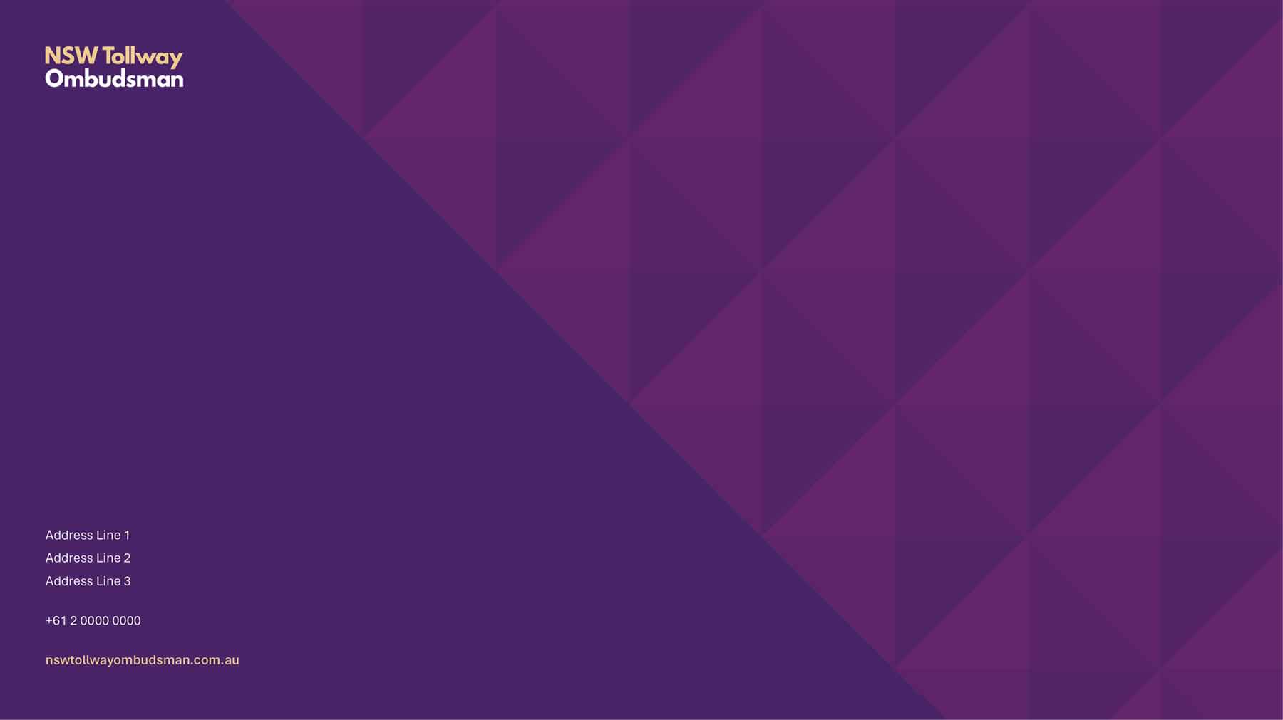
NTOL's existing visual identity relied heavily on dense, dark colours, which made applied materials feel heavy. We realigned the palette by introducing lighter colours to balance the darker brand tones.
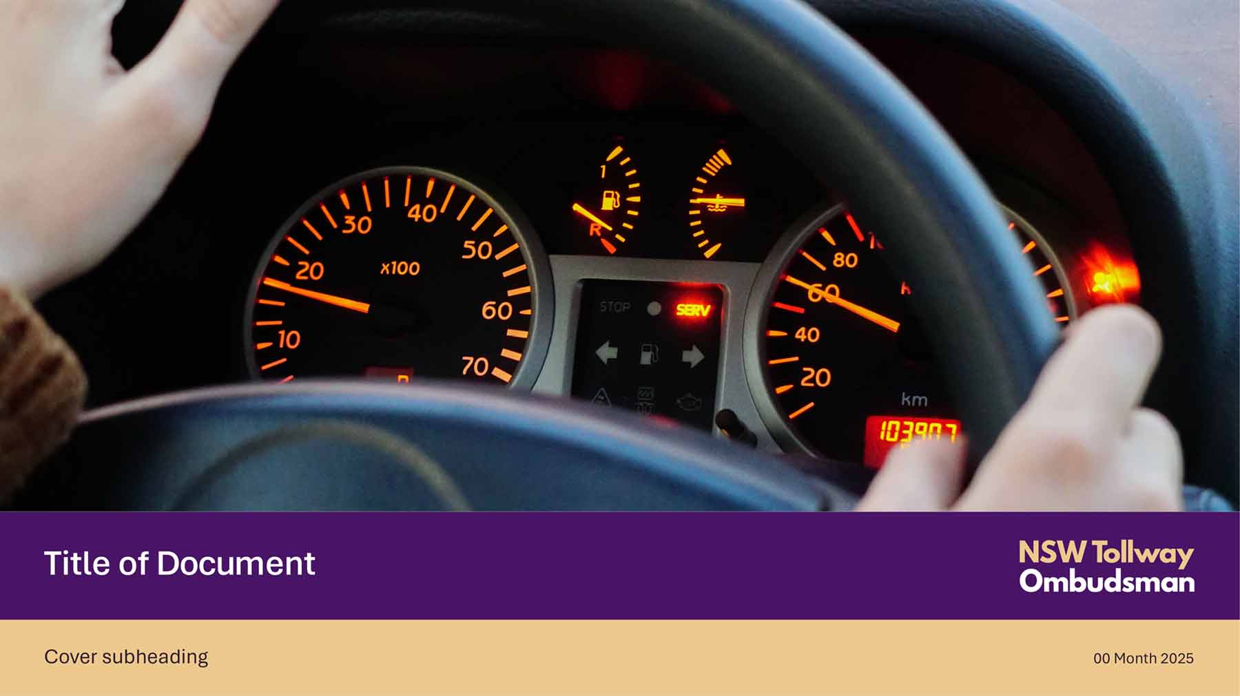
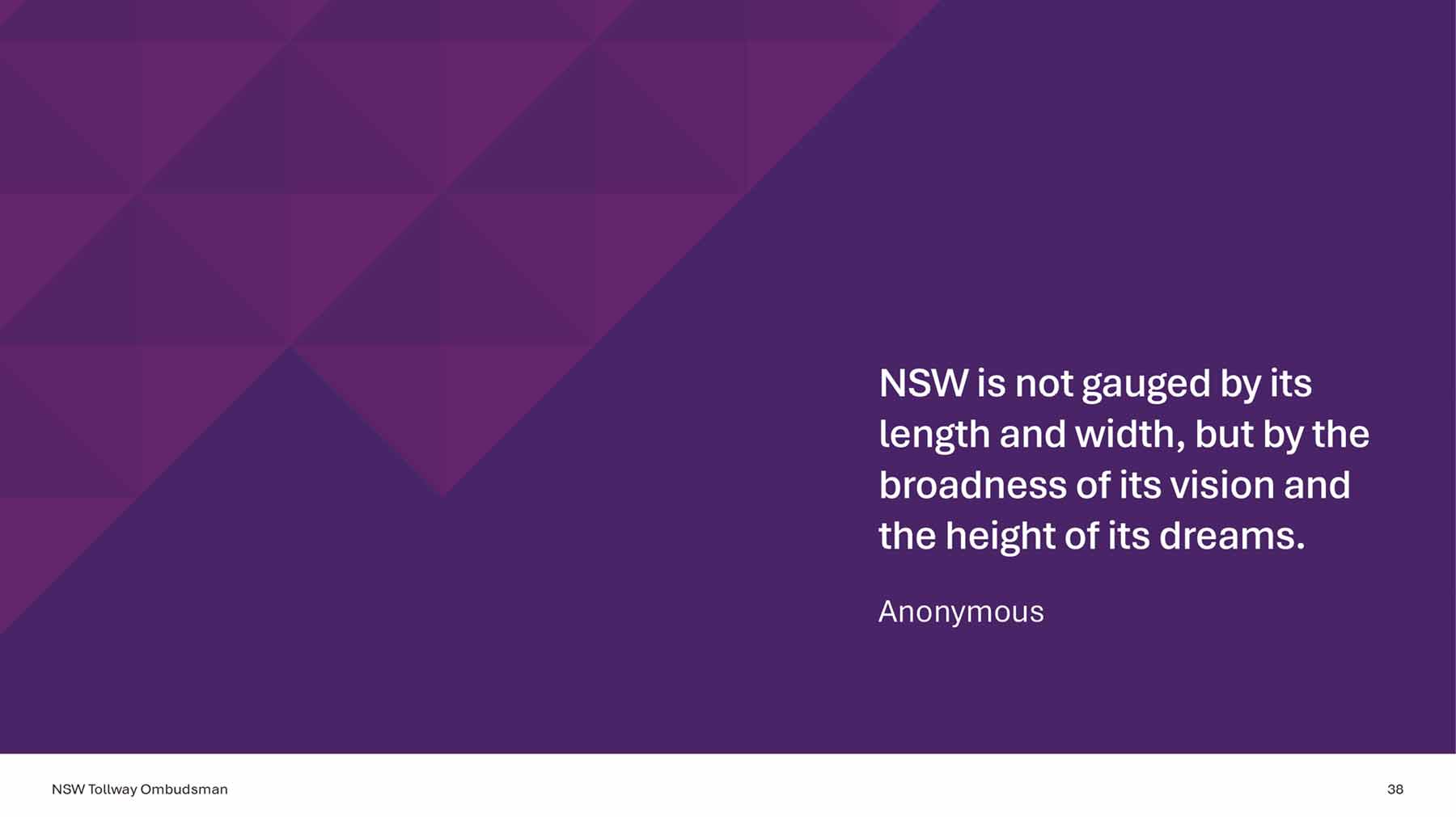
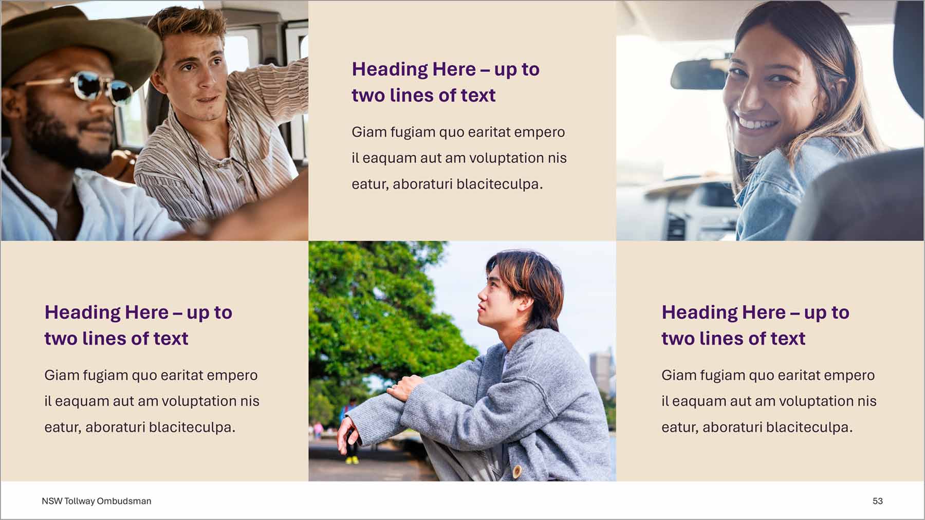
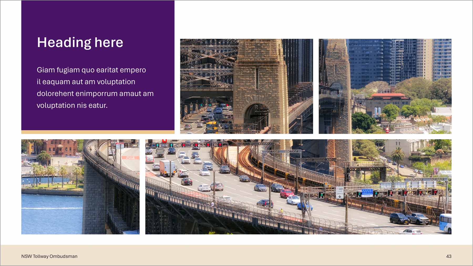
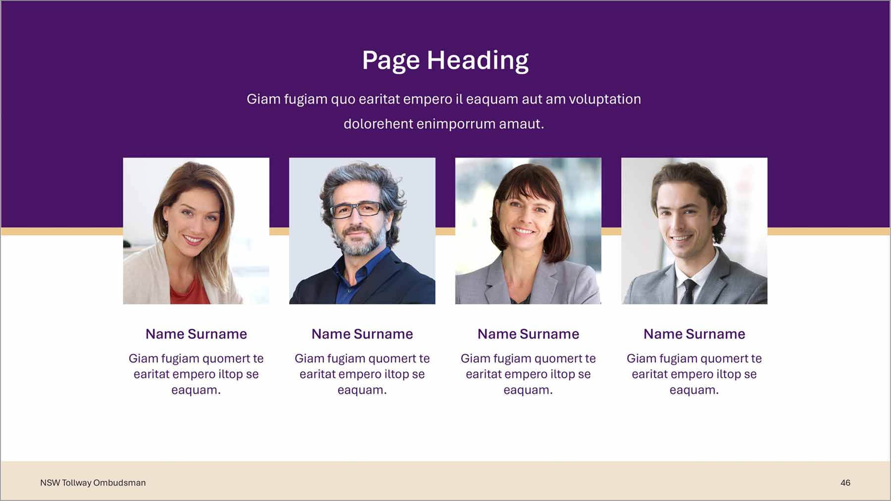
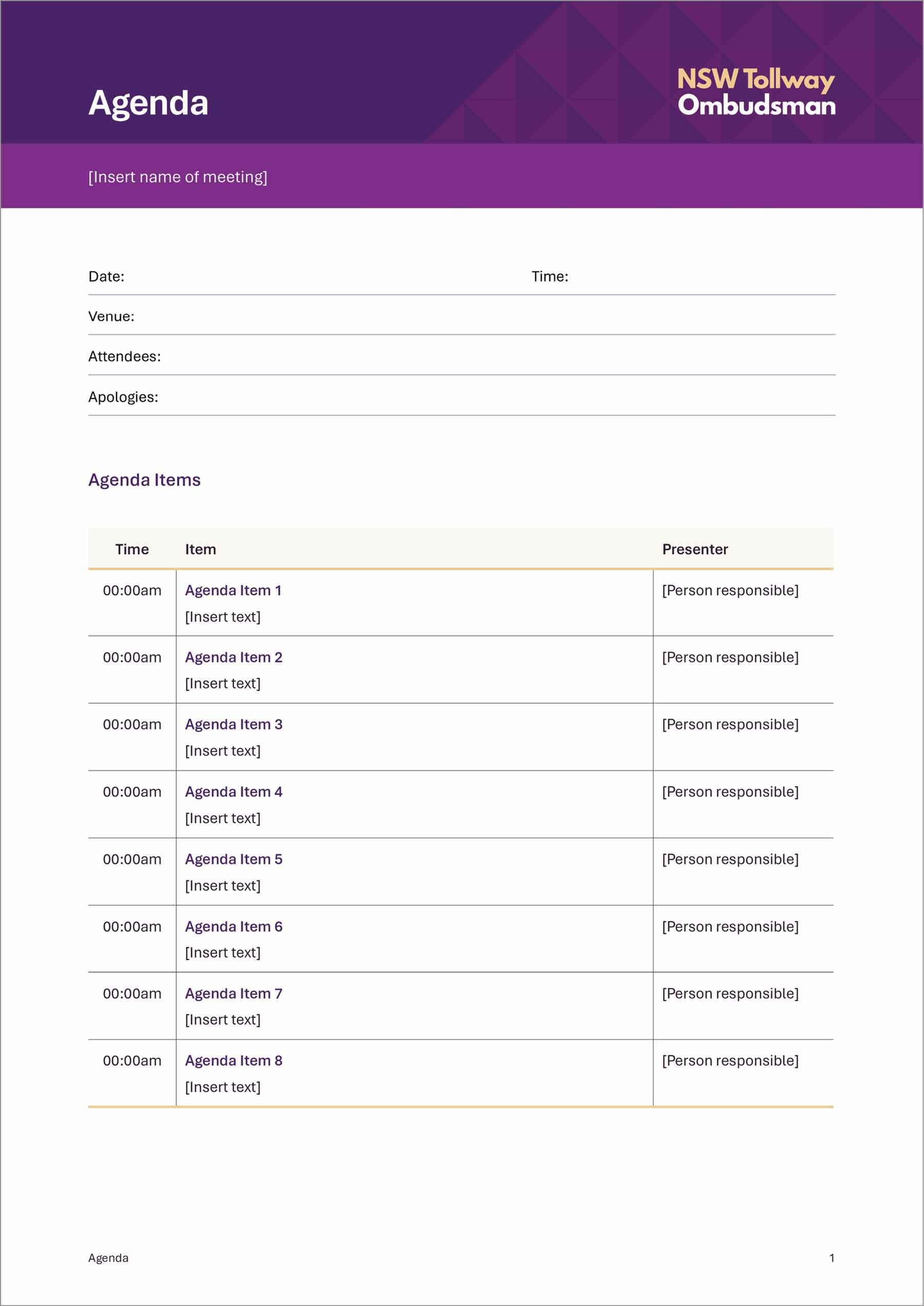
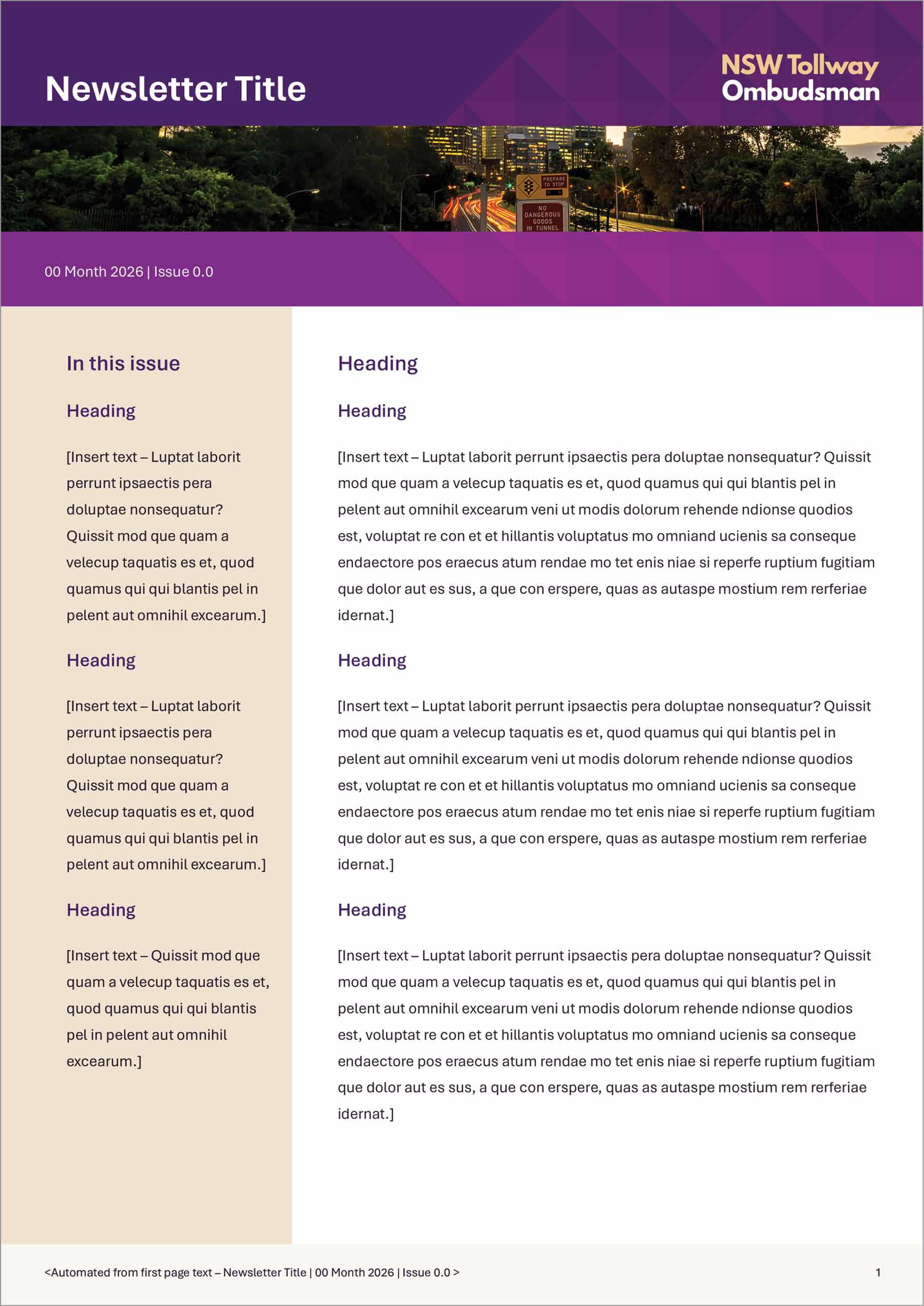
We designed all of the templates, which were then built to WCAG 2.2 accessibility guidelines. The suite covers NTOL's everyday documents, from letterheads, agendas and minutes to fact sheets, newsletters, reports and internal corporate policies. Colour combinations were tested for contrast, and the templates use structured heading styles, a logical reading order, alt text and accessible table formatting.
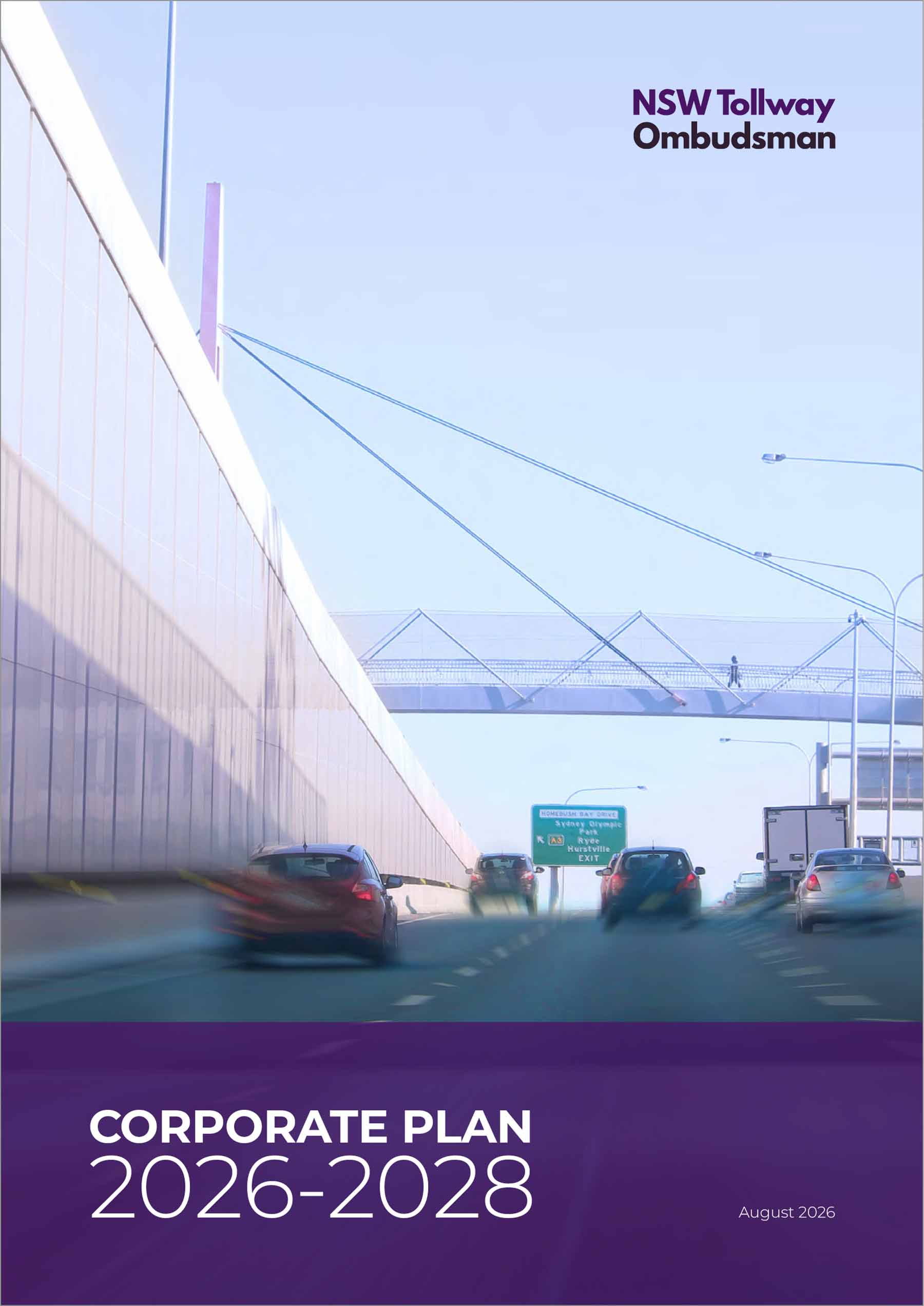
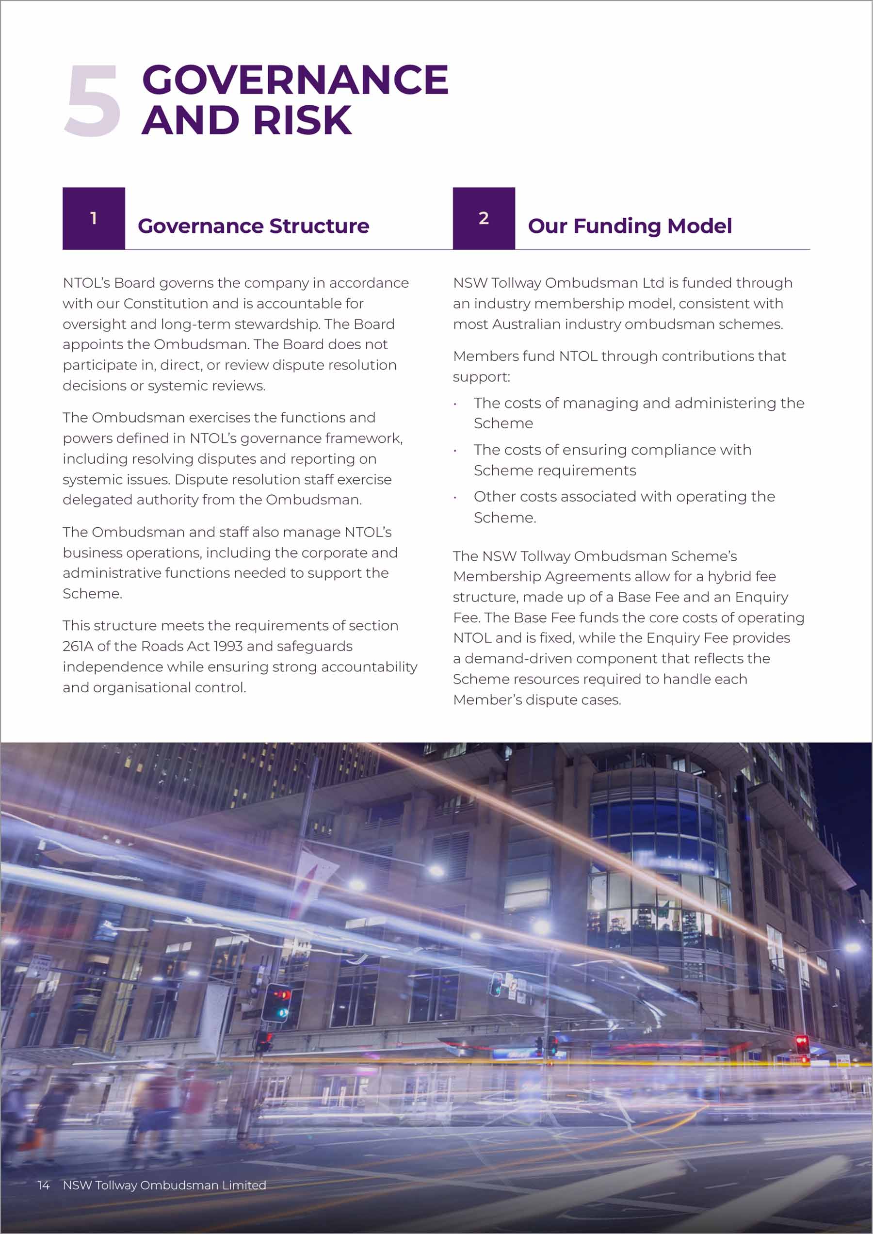
We also designed a 16-page Corporate Plan that sets out NTOL's direction in a clear, accessible format, along with email signatures and Teams backgrounds to carry the realigned brand into daily communication.
NTOL now has a consistent, accessible brand system that reflects its role as a fair and independent public service.
► Brand realignment
► Word templates: Agenda, Fact Sheet, Internal Corporate Policies, Letterhead, Minutes, Word Newsletter, Report
► PowerPoint Presentation template
► Excel charts and graphs template
► 16pp Corporate Plan
► Email signatures
► Teams backgrounds


► NSW toll road customers and the wider community
► Toll road operators and toll service providers
► Government, regulators and industry stakeholders
The NSW Tollway Ombudsman (NTOL) is a not-for-profit, independent body that helps NSW toll road customers resolve complaints about tolling services and products that haven't been settled with the toll operator or provider.
As an ombudsman serving the public, NTOL needs its communications to be clear, credible and usable by everyone. This meant its Microsoft templates had to meet WCAG 2.2 accessibility guidelines, so documents created by staff would be accessible to all readers.
NTOL also needed brand realignment work to bring its identity into a consistent and implementable visual brand identity, resulting in a similar look and feel across all the deliverables.
NTOL's existing visual identity relied heavily on dense, dark colours, which made applied materials feel heavy. We realigned the palette by introducing lighter colours to balance the darker brand tones.
We designed all of the templates, which were then built to WCAG 2.2 accessibility guidelines. The suite covers NTOL's everyday documents, from letterheads, agendas and minutes to fact sheets, newsletters, reports and internal corporate policies. Colour combinations were tested for contrast, and the templates use structured heading styles, a logical reading order, alt text and accessible table formatting.
We also designed a 16-page Corporate Plan that sets out NTOL's direction in a clear, accessible format, along with email signatures and Teams backgrounds to carry the realigned brand into daily communication.
NTOL now has a consistent, accessible brand system that reflects its role as a fair and independent public service.
► Brand realignment
► Word templates: Agenda, Fact Sheet, Internal Corporate Policies, Letterhead, Minutes, Word Newsletter, Report
► PowerPoint Presentation template
► Excel charts and graphs template
► 16pp Corporate Plan
► Email signatures
► Teams backgrounds